We’re not sure about you, but we just had the most thrilling, suspenseful, and fun month we’ve had in a while. The 2014 FIFA World Cup may be over, but we’re still amazed by not only the game outcomes and level of athleticism, but also by the wealth of interesting statistics that comes along with a major international sporting event.
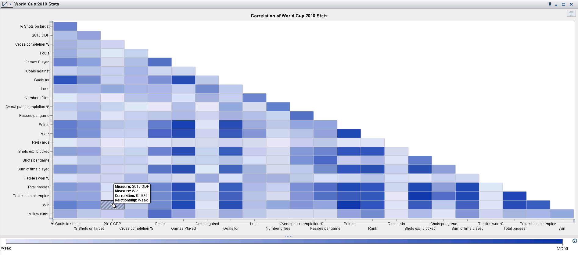
Here at SAS, we couldn’t help ourselves and had to take some of the World Cup data we found and throw it into SAS Visual Analytics. As you may know, SAS Visual Analytics provides deep insights into your data and advanced analytics on the fly. It literally takes seconds to load in your data and start exploring it. We took advantage of this speed to build some neat correlation matrices, line charts, bar charts, and geo maps. Do you think you know it all when it comes to the World Cup? Try answering these questions:
- Do rich countries tend to win football games more often?
- How old is Lionel Messi and how does his age affect his team’s market value?
- Do home teams have an advantage? (Maybe not this year, but what about the previous World Cups?)
- How does teamwork affect a game?
- What affect do red cards have on the outcome of a game?
As you can imagine, we had a great time answering these questions and analyzing the results. Check them out in the SAS Visual Analytics community.
While you’re at it, be sure to check out the rest of the SAS Visual Analytics Community. We’re always keen to answer any questions about VA on there and you’ll find some great resources to help you get started with VA, if you haven’t already. We would love to see and hear about any great visualizations you’ve come up with as well. What would you like to see visualized next? Let us know and we may just bring your idea to life!


1 Comment
Hi Varsha, interesting correlation matrix on the world cup data. Another interesting visualization available in SAS Visual Analytics that was often used during the world cup is the heat map http://blogs.sas.com/content/sastraining/2014/07/21/hot-hot-heat-map/