Often we want to visualize the relationship between variables over time. The understanding of such data can be improved by viewing the animated graph over time. With SAS 9.4, you can create animated graphs using the new animation options on the OPTIONS statement and the PRINTER destination. A popular example an
English
Animation using SGPLOT
Using fast food prices as an index of purchasing power
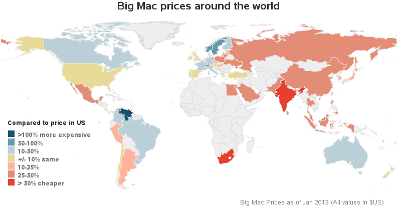
I recently read an interesting article in The Economist, where they describe "The Big Mac index." This is an index they invented as a lighthearted guide to compare currencies in different countries. In their article they create a multi-panel display (similar to a dashboard) where they compare the index for several countries using
SAS administrator connections and resources
A good chunk of the SAS year revolves around SAS Global Forum. Pre-conference, everyone is busy polishing presentations and planning meetings. Post-conference is the best—attendees come back to Cary with heads full of customer ideas to implement and notebooks full of contacts to follow up on. One user's request found its