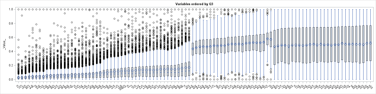
Often we need to plot the response values for binary cases of a classifier. The graph below is created to simulate one seen at http://www.people.vcu.edu/ web site of the shock index for subjects with or without a pulmonary embolism. In this case, the data is simulated for illustration purposes only. There
English
Binary Response Graph
Gaining the Most from Your Garlic
We’ve all heard the tales about garlic protecting against evil and warding off vampires, but garlic is much more than an accessory to be worn around your neck at Halloween! Garlic provides numerous health benefits and is one of the most popular seasoning ingredients around. It goes well in almost
An exploratory technique for visualizing the distributions of 100 variables
In a previous blog post I showed how to order a set of variables by a statistic. After reshaping data, you can create a graph that contains box plots for many variables. Ordering the variables by some statistic (mean, median, variance,...) helps to differentiate and distinguish the variables. You can