
Data management strategy for analytics

Avoid frustrations by following these 5 tips from David Loshin to create a successful data management strategy for analytics.
Avoid frustrations by following these 5 tips from David Loshin to create a successful data management strategy for analytics.
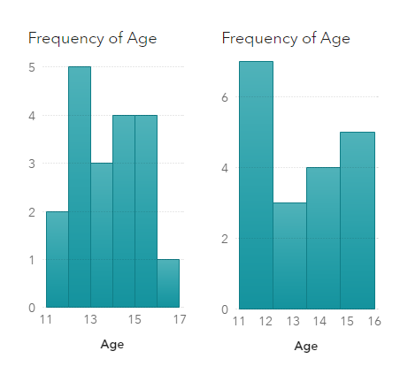
Visualization of data density estimation, which is often used in statistical analysis and machine learning, will show the data’s characteristics like distribution, skewness and modality, etc. Commonly-used data density visualizations include boxplot, histogram, kernel density estimates, and some other plots. This blog post visualizes the kernel density estimates superimposing on histogram using SAS Visual Analytics.
When I'm at a social gathering, someone always asks what type of work I do. I like to keep my social life separate from my work, therefore I usually give a vague answer such as "software" (and quickly change the topic). How vague or specific is your response? How vague