The DO Loop
Statistical programming in SAS with an emphasis on SAS/IML programs
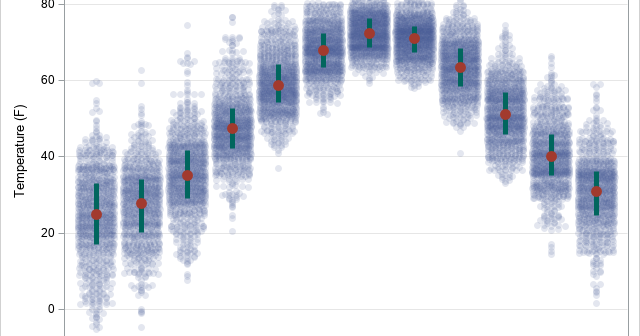
My colleague, Mike Drutar, recently showed how to create a "strip plot" that shows the distribution of temperatures for each calendar month at a particular location. Mike created the strip plot in SAS Visual Analytics by using a point-and-click interface. This article shows how to create a similar graph by

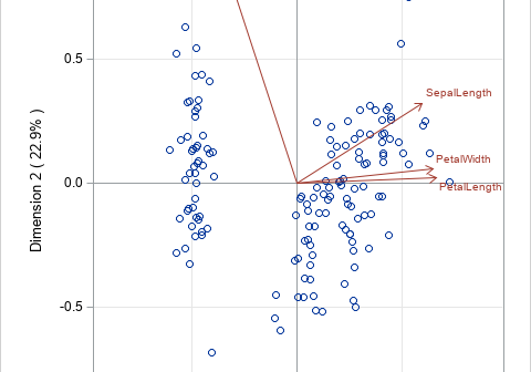
Biplots are two-dimensional plots that help to visualize relationships in high dimensional data. A previous article discusses how to interpret biplots for continuous variables. The biplot projects observations and variables onto the span of the first two principal components. The observations are plotted as markers; the variables are plotted as

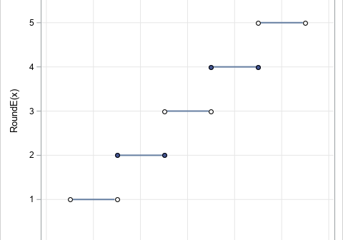
In grade school, students learn how to round numbers to the nearest integer. In later years, students learn variations, such as rounding up and rounding down by using the greatest integer function and least integer function, respectively. My sister, who is an engineer, learned a rounding method that rounds half-integers
