Comparative density plots
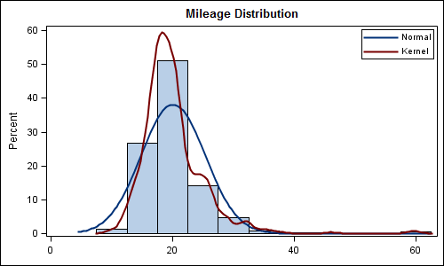
Recently a user posted a question on the SAS/GRAPH and ODS Graphics Communities page on how to plot the normal density curves for two classification levels in the same graph. We have often seen examples of a distribution plot of one variable using a histogram with normal and kernel density curves. Here is a simple example: Code Snippet:

