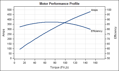
Often it is useful to view multiple responses by a common independent variable all in the same plot. SGPLOT procedure and GTL support the ability to view two responses, one each on the Y and Y2 axes by one independent variable (X) in one graph. Yes, you can also have X
Tag: GTL
Calendar Heatmaps are an interesting alternative view of time-series data. The measured value is displayed as color mapped cells in a calendar. Calendar Heatmaps can be easily created with SAS 9.3 using just the HEATMAPPARM, SERIESPLOT and BLOCKPLOT statements in GTL and some simple data manipulation. The example below shows
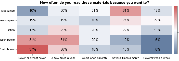
The heatmap is a graphical representation of a table where colors are used to represent the values in the table. This is an effective graphic for finding the minimum and maximum values across the table and may surface patterns in the data. With the addition of the HEATMAPPARM statement to
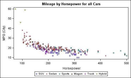
Rick Wicklin's blog post on using abbreviations provided a solution for a long standing pain. When writing a new GTL program for simple graph, often the bulk of the code is boiler plate. To create a simple scatter plot of weight by height, you need to type in the following program:
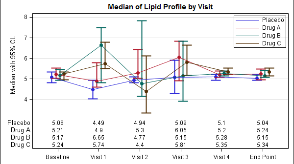
The display of statistics, aligned with graphical plot of the data, is a common requirement for graphs, especially in the Clinical Research domain. In the previous post on Discrete Offset, I used an example of the Lipid Profile graph. Now, let us use the same example and add the display of statistics in