Tag: Forest Plot

Data Visualization
Sanjay Matange 0
Axis Customizations

All axis customization features are always welcome.  Especially since SGPLOT statements can often be used to create non standard graphs, having the ability to customize the axes is important.  This article presents ways in which you can customize the discrete axes. By default, the x axis will try to display the

Data Visualization
Sanjay Matange 4
Report from PharmaSUG 2015

PharmaSUG 2015 in Orlando was held at the Renaissance had a record breaking attendance of over 650.  Weather was great, except for a huge downpour on the evening of the last day.  All the popular presenters were in attendance including Art Carpenter, Kirk Lafler, Arthur Li and many others. Presentations

Data Visualization
Sanjay Matange 3
Graph Table

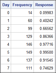
A common scenario is where we have a table of multiple measures over time. Here we have a simple example of Frequency and Response by Day.  The Response is a linear function of the Frequency, as shown in the table on the left below. The  shape of the data is

Data Visualization
Sanjay Matange 5
Clinical Graphs

This week I had the opportunity to present a 1/2 day seminar on creating clinical graphs using the SG procedures during an In-House SAS Users' group meeting.  I have presented this seminar quite a few times now, and I always learn something. The audience was very receptive, with some people

Data Visualization
Sanjay Matange 4
GTL Layouts

The Graph Template Language (GTL) provides you the ability to create complex graphical layouts. We have seen how to create a regular grid of cells based on one or more classification variables using the SGPANEL procedure.   Each cell contains the same type of plot.  This topic was covered in Dan's article on