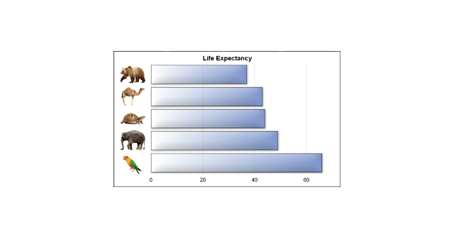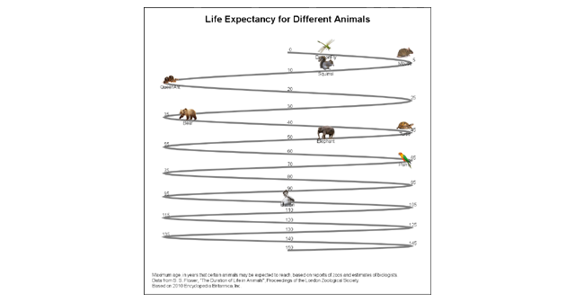
Last week I published an article on creating bar charts with visual category values. The idea was to use visual icons for the category values in a HBAR of age by animal. For the data, I referred to a visual from the 2010 Encyclopedia Britannica Inc. that I found on the
English
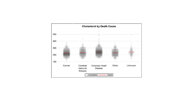
A grouped box plot created by SGPLOT VBOX / HBOX statement or GTL BOXPLOT statement will display groups within categories using group colors and puts the color swatches representing the group values in the legend. This works well for a color graph created as shown below. title 'Distribution of Cholesterol
We often say a picture (or graph) is worth a thousand words. So, recursively, this could apply to other text in the graph. I thought it would be interesting to see if we can create a graph with visual categories. Another benefit is that such visual categories are inherently meaningful
In his recent blog article on Drawing Paths on a Map using SGPLOT, Robert Allison showed us visually the path computed by the captain of his return flight from Orlando. As usual, one can rely on Robert to put in visual form some interesting bit of information. Thanks, Robert. I
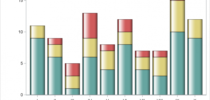
This post shows you how to make a bar chart and an X-axis table; ensure consistency in the order of the legend, bar subgroups, and axis table rows; coordinate the colors for each of those components; and drive all the color choices from an attribute map.
SAS Global Forum 2017 is around the corner and SAS users are gearing up to travel to Orlando for a blockbuster conference. ODS Graphics is now a well known component of Base SAS and many readers of this blog who are proficient users of SG Procedures and GTL can look
This article is motivated by a recent question on the Communities Web Site on creating a scatter plot with additional summary information. Recently, I described how to create a scatter plot with a box overlay. While such graphs have been discussed in earlier posts, this article provided a visual benefit
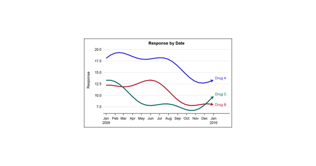
This is the 4th installment of the Getting Started series. The audience is the user who is new to the SG Procedures. Experienced users may also find some useful nuggets of information here. Series plots are frequently used to visualize a numeric response on the y-axis by another numeric variable on
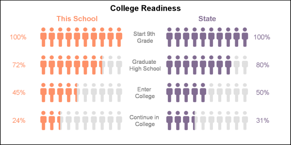
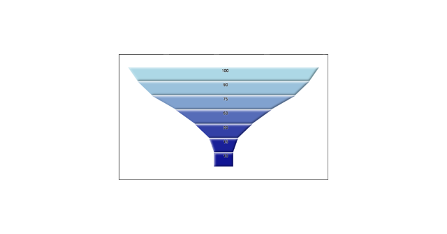
Funnel graphs are useful to track the number of visitors passing through various pages of a website or the number of patients in a study. The graph shows visually the retention of users or subjects in a study across levels of a marketing cycle or the study. One common representation
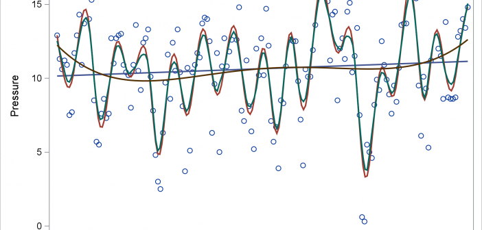
Today's post illustrates the REG, PBSPLINE, LOESS, SERIES, and SPLINE statements in PROC SGPLOT. The GROUP= and BREAK options in the SERIES statement are also discussed.