Tips and Tricks

Data Visualization
Sanjay Matange 2
Axis values and hint

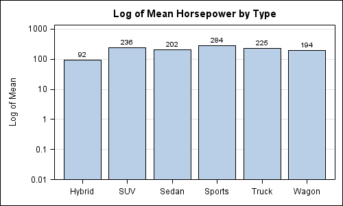
Getting the axis values just right generally requires some work, and the values you want can change from case to case.  One such example was discussed by Dan Heath in his post on custom axis values.  Here Dan shows the usage of non uniform axis values using the VALUES option on

Data Visualization
Sanjay Matange 3
Just a legend, please

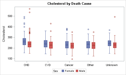
Recently, an interesting question was posed on the previous article on this blog by a reader.  Can we use the new DiscreteAttrMap feature to create just a legend with specific entries, with no graph.  The question was intriguing enough that I did not wait to ask - "Why?".  I just got

Data Visualization
Sanjay Matange 1
Bar chart on interval axis

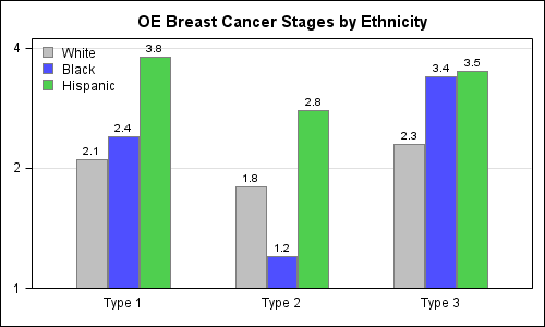
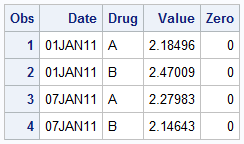
Recently, a user asked about creating a Bar Chart of Value by Date, where the dates are displayed on a scaled interval axis.   Consider this simulated data set of value by date and treatment shown below.  This data set only has one value for each date and treatment combination. We can use the VBAR statement

Data Visualization
Sanjay Matange 4
Simpler is better

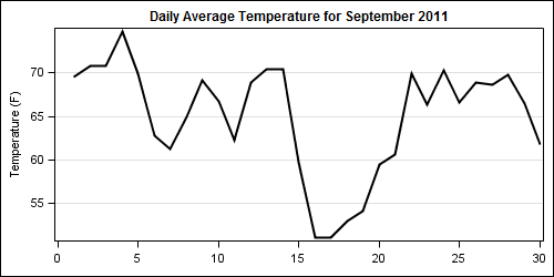
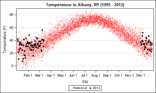
A recent article in the SAS and R blog was about current winter temperatures in Albany, NY.  The temperature data for the recent winter (Dec 2011 - Mar 2012) was plotted on a polar graph. Robert Allison posted an article on displaying the same data as a Polar Graph using SAS/GRAPH .  Here is his

1 29 30 31 32 33 35