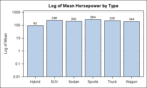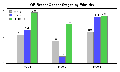
Recently I posted an article on this blog on how to create bar charts with log response axes in response to a question by a user. This generated some feedback suggesting that bar charts should not be used with log response axes or with a baseline of anything other than
Author
Getting the axis values just right generally requires some work, and the values you want can change from case to case. One such example was discussed by Dan Heath in his post on custom axis values. Here Dan shows the usage of non uniform axis values using the VALUES option on
Creating bar charts with log response axis has come up a few times in the past few days. Before we look into how we could do this, it would be worth pointing out the considerable opinion in the blogosphere against use of log response axes for bar charts. See BizIntelGuru and
On Friday before the conference, I presented a 1 day "developer led" seminar on SG Procedures and GTL, along with a discussion of new features for SAS 9.3. The experience was very gratifying as all users were now using SAS 9.2, and some were using SAS 9.3. We had a lively
Recently, an interesting question was posed on the previous article on this blog by a reader. Can we use the new DiscreteAttrMap feature to create just a legend with specific entries, with no graph. The question was intriguing enough that I did not wait to ask - "Why?". I just got
SAS Global Forum 2012 at Orlando, Florida is just round the corner and we are excited to see so many presentations offered by users on SG procedures and GTL. We'll add a few more on new SAS 9.3 features of SG procedures and GTL. These include cluster groups for discrete and interval axes, cluster
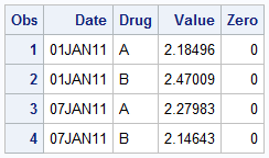
Recently, a user asked about creating a Bar Chart of Value by Date, where the dates are displayed on a scaled interval axis. Consider this simulated data set of value by date and treatment shown below. This data set only has one value for each date and treatment combination. We can use the VBAR statement
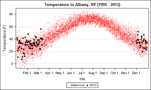
A recent article in the SAS and R blog was about current winter temperatures in Albany, NY. The temperature data for the recent winter (Dec 2011 - Mar 2012) was plotted on a polar graph. Robert Allison posted an article on displaying the same data as a Polar Graph using SAS/GRAPH . Here is his
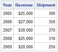
A user recently posted a question in the SAS communities forum about how to best display two measures by one classifier using a Bar-Line graph, where the scale of the two measures is vastly different. This got me thinking about various different ways to represent such data. Here are some of my thoughts,
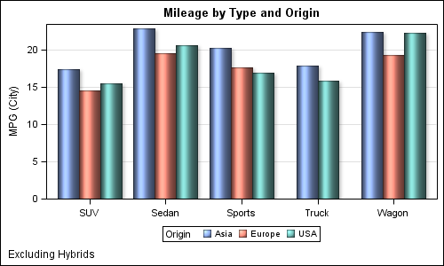
The topic of cluster groups comes up often. By cluster group I am referring to the feature in bar charts where the group values are displayed side by side. With SAS 9.3, SG Procedures support stack or cluster grouping for Bar Charts and overlay or cluster grouping for all other