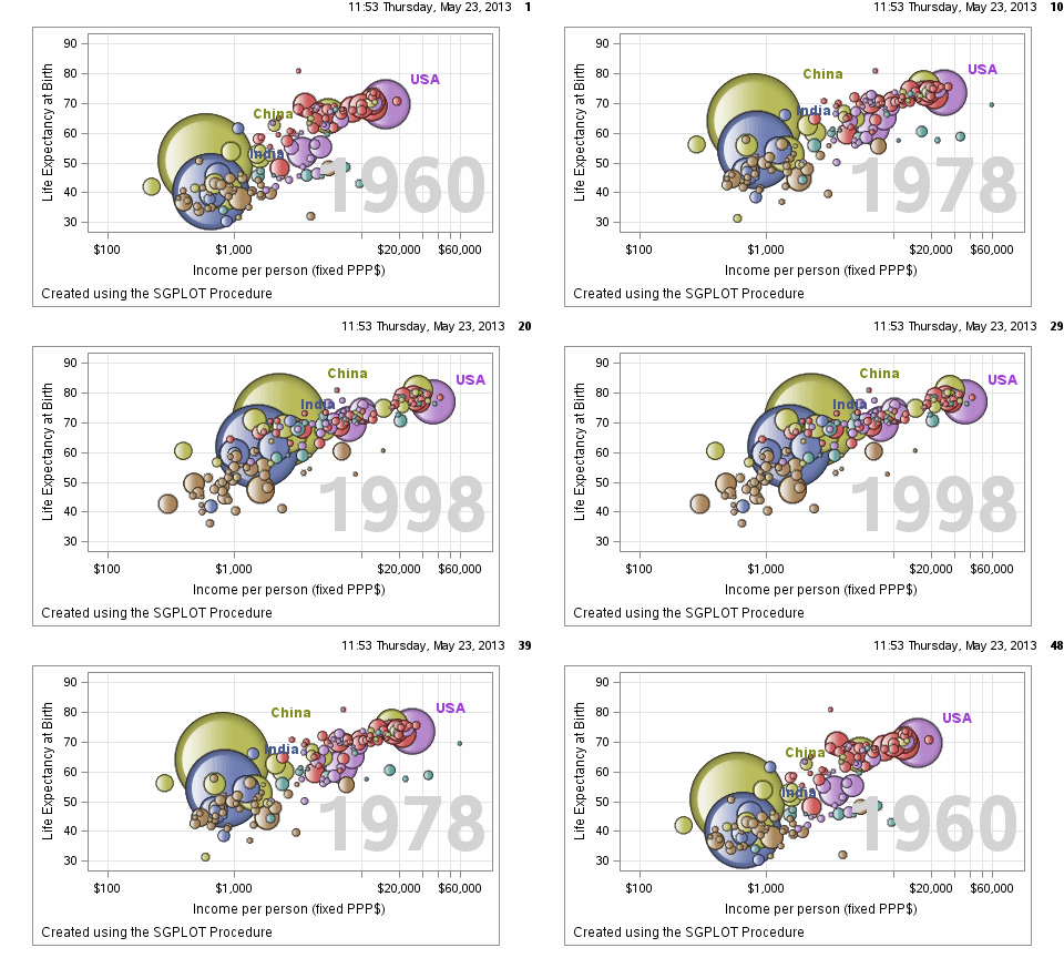
Often we want to visualize the relationship between variables over time. The understanding of such data can be improved by viewing the animated graph over time. With SAS 9.4, you can create animated graphs using the new animation options on the OPTIONS statement and the PRINTER destination. A popular example an
Author
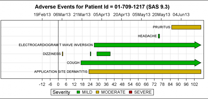
The PharmaSUG 2013 conference in Chicago this week was awesome. From the perspective of graphics, there was great interest in using SG Procedures, Designer and GTL for building clinical graphs. It was nice to see many papers by users on how they are using these tools for creating graphs on a daily
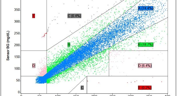
The SAS Global Forum conference last week was awesome. From the perspective of graphics, there were more papers from uses on graphics and ODS graphics then in recent times. I will post a summary shortly. One of the interesting papers was "#113-2013 - Creating Clark Error Grid using SAS/GRAPH and Annotate..."
The 2013 SAS Global Forum is around the corner in San Francisco and the anticipation is building. Early indications are that attendee registration is up from last year, and we are looking forward to a great conference starting Sunday, April 28. It is great to see the large and diverse offering
In the previous two articles we discussed Discrete Attribute Maps, and how these can be used to ensure that group attributes like color are consistently mapped to group values regardless of their position in the data. Now, let us take a look at the attributes map that allows you to
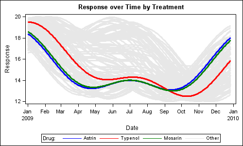
Last week I wrote about how you can use the Discrete Attributes Map to ensure that group values with specific names are represented in the graph with specific colors or other visual attributes such as marker symbol or line pattern. This attributes map also supports a special keyword "OTHER" which can be used to
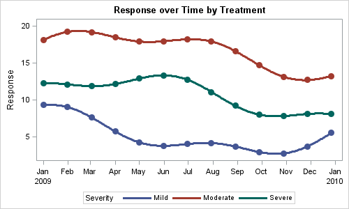
You created a graph of Response over Time by Severity where Severity has three levels, "Severe", "Moderate' and "Mild". How do you ensure that "Severe" is always red in your graph, regardless of the data order? Normally, when creating any graph with a GROUP role, the distinct group values are assigned the style
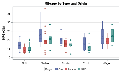
A frequent question we get from users is how to create a box plot with custom whiskers lengths. Some want to plot the 10th and 90th percentile, while other want the 5th and 95th percentiles. The VBOX statement in the SGPLOT procedure does not provide for custom whiskers. Also, unlike GTL,
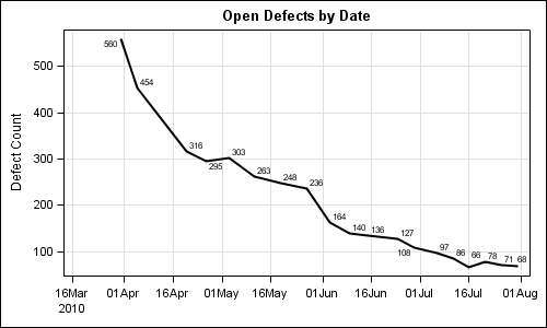
SG procedures and GTL use a collision avoidance algorithm to position data labels for a scatter or series plot. This is enabled by default. The label is preferably placed at the top right corner of the marker. The label is moved to one of the eight locations around the marker to
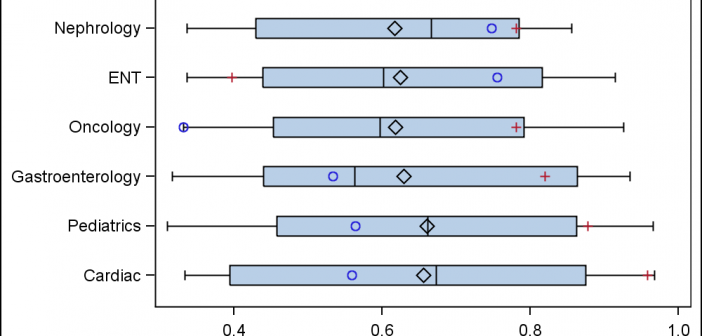
A common request we have been often hearing is for display of the distribution of data as a box plot, along with some detailed information overlaid. For example, one may have ratings data of all the hospitals in a region by different specialty, and you want to view this distribution