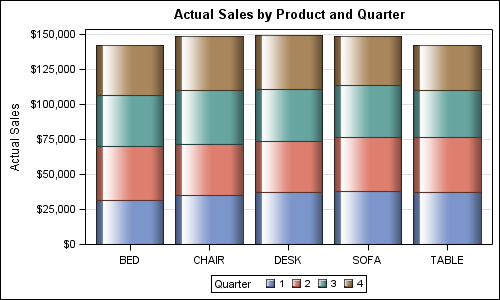
Creating bar charts with group classification is very easy using the SG procedures. When using a group variable, the group values for each category are stacked by default. Using the sashelp.prdsale data set and default STAT of SUM, here is the graph and the code. SGPLOT code: proc sgplot data=sashelp.prdsale;
Author
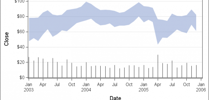
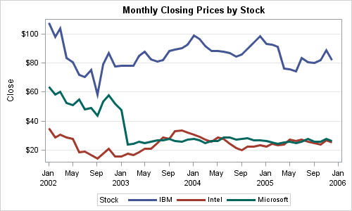
Recently my boss came across a graph where a time series plot was modified to include a "thickness" response. We wondered if this would be a good addition to the GTL / SG Series plot statement. What would the result look like, and what are the pros and cons? So, I took up
SAS 9.4 was released a month ago, and we are excited about all the new features in SG Procedures, GTL and Designer. I wrote an article on SAS 9.4 graph features last month, and promised more to come. What then could be better than this Tech Talk video hosted by our
The graphs produced by the SG procedures (and GTL) have a default look and feel designed for the common use cases. However, everyone has a preference for some special features that make the graphs unique. Fortunately, extensive customizations can be made to graphs produced by these tools using statement and
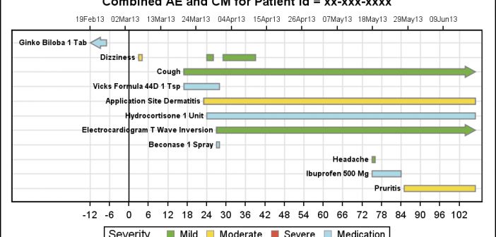
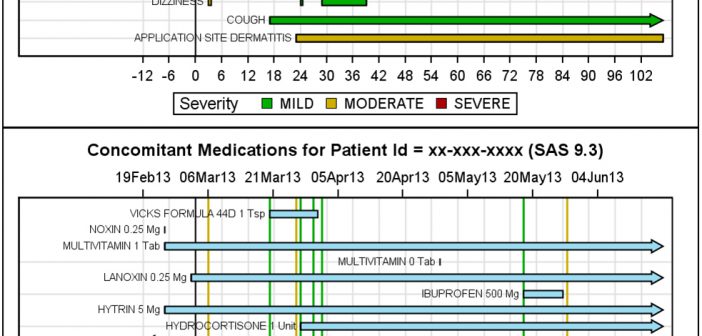
As promised, here is a better combined AE-CM graph, using some of the UI improvements suggested by our UI expert, Riley. His suggestions helped to reduce the clutter in the graph, while still keeping all the features preferred by our users. Click on the graphs for a higher resolution image.
At the SAS Global Forum 2013 in San Francisco, I presented a paper on making Patient Profile Graphs using SAS. You can follow the link to see the graphs presented in this paper. In that paper, I presented ways to create AE, CM, VS and Lab graphs. I discussed aligning the
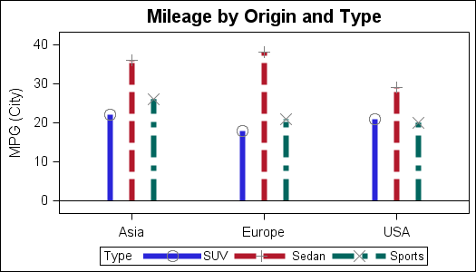
Last week, I presented some highlights of the new features for SG Procedures and GTL in SAS 9.4. Now, let us dig in a bit deeper. For a plot without a GROUP role, setting an attributes was always easy with SG procedures. All you need to do to set bar color
SAS 9.4 releases today with a ton of new features. As eloquently stated by Craig Rubendall, the driving themes are "Enable. Simplify. Innovate". The same sentiment applies to the ODS Graphics, with a ton of new features for the SG Procedures, GTL and ODS Graphics Designer. In the next few articles,
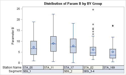
Recently a user chimed in on the SAS Communities page, requesting a way to add some observation level annotation to a box plot. Wendy was delighted to see a graph created by the UNIVARIATE procedure called "Schematic Plot". In this graph, the box plot of the analysis variable is shown with
A Bar Line graph is commonly used in many domains. The SGPLOT procedure makes it easy to create bar line graphs where the user can customize it in many different ways. This post is prompted by a recent question on the communities page on creating such a graph, with one bar and