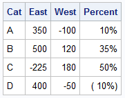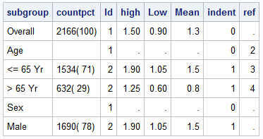
The GCHART procedure has a popular option called G100 to display all the subgroups in % format such that all the subgroup values add up to 100% for each group. Each subgroup is labeled with its own % values. SGPLOT procedure does not such an option, but with a little bit of
Author
SAS Global Forum 2014 was a great success, with the SAS Studio, a web based SAS interface garnering a lot of attention. SAS also announced the availability of SAS Analytics U, providing free web based access to SAS analytics for students, faculty and researchers. The conference had multiple paper and Super demos on data
The SAS Global Forum 2014 is just around the corner starting Sunday, March 23 and I am eager to attend creative presentations from SAS users on ODS Graphics. Adoption of SG procedures, GTL and ODS Graphics Designer is growing among users and I see many promising papers. Papers by users: Something for Nothing!
Often we need to plot multiple response variables on Y axes by a common variable on X axis. When the response variables are very different in magnitudes or format, we prefer to plot the variables on separate Y (Left) and Y2 (Right) axes. Here is some sample data with three response
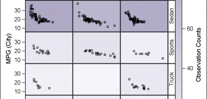
Classification panels are a very popular visual representation of the data, where the data is gridded by class variables all in one graph. This makes it easy to compare and contrast the data by these class variables. The SGPANEL procedure makes this easy, and most of the time it is
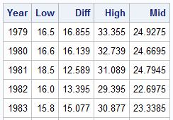
Browsing graphs on the web, this graph caught my eye: The Arctic Sea Ice Volume Graph. My interest is not so much in the debate on Climate Change or Global Warming. To me, this graph has some interesting features that can help show the benefits of plot layering to
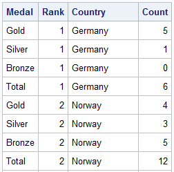
The attention of the world is now on Sochi and the Winter Games. Gold, Silver and Bronze medals are being earned by these amazing athletes, and everyone has an eye on the tally. Andre sent me a link to TRinker's R Blog, showing a graph of the current tally. Andre
One of the most popular graph amongst clinical and pharmaceutical users is the Survival Plot as created from the LIFETEST Procedure. This is one graph that users most often want to customize. See Creating and Customizing the Kaplan-Meier Survival Plot in PROC LIFETEST - Warren F. Kuhfeld and Ying So, SAS Institute
Most simple graphs generally include graphical representation of data using various plot type such as bar charts, scatter plots, histograms, box plots step plots and more. Both SG procedures and GTL provide many easy ways to create such graphs. However, for many real world use cases, we need to display related textual data in
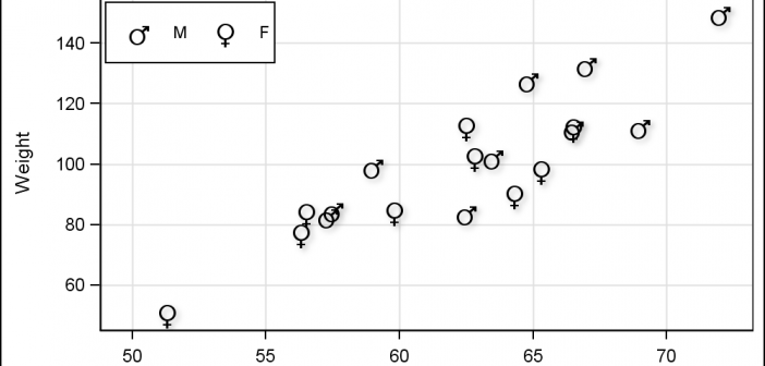
Users have often expressed the need for more marker symbols. ODS Graphics supports over 30 scalable marker symbols, both filled and empty. As mentioned in an earlier article, with SAS 9.4, filled markers can now have outlines and fills, and can also have special effects. Also with SAS 9.4, now you