Recently, SAS released SAS Solutions OnDemand for academics. An academic user who is signed up for this can use the SAS Web Editor application to do all their data analysis over the web using a hosted server at SAS. This frees up the user from having to install the software on their own computers, or having to travel to the computer lab to do their assignments.
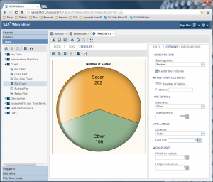
The SAS Web Editor presents an intuitive interface that provides you the access to the features you expect in a SAS session. The user interface is shown below, including a graph created using one of the built-in graph tasks. Click on the image for a larger view.
The WebEditor UI includes all the tools you expect, including the program editor, output and log windows. You can do all your normal work, including submitting data and procedure steps to analyze your data.
The UI includes code snippets and tasks that help you get started. Tasks include six new tasks to create commonly used graphs using the SGPLOT procedure as listed under the "Graph Tasks" in the panel on the left.
Displayed above is the Pie Chart, a popular graph for visualizing data. The Pie Chart is a very good way to visualize a part-to-whole relationships as shown above. Even without the frequency counts in each pie slice, it is very easy to get a good feel for the proportion of Sedans in the whole population of cars.
This is especially true in the pie chart above, which has the two slices positioned symmetrically about the vertical axis. This is based on Gestalt perception using the law of pragnanz which says we prefer symmetric and simple organizations. The WebEditor Pie Chart task automatically does this for you.
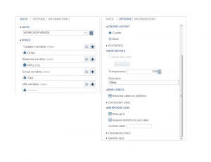
When you run the Pie Chart task, it presents you with a UI to set the data roles to create the graph from a SAS data set. Then, using the options tab, you can set other options to customize your graph.
Other graphs supported are the Bar Chart, Bar Line Chart, Line Chart, Series Plot and Scatter Plot.
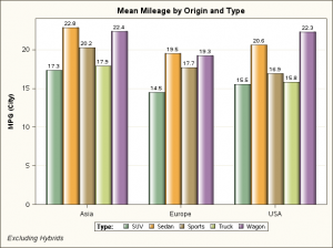
Bar Chart Task Graph:
Data and other options for Bar Chart task:
As can be seen above, I have used a data set derived from sashelp.cars, excluding hybrids. WebEditor also allows you access to the ODS Graphics Designer. Use the preferences drop down menu at the top right to install and launch Designer. All in all, the WebEditor is a great way to get started with SAS.


2 Comments
Really cool stuff. So EASY!!!
IS it possible to have the pie graph show percentage instead of frequency count?