In December of last year, the book "Statistical Graphics Procedures by Example" co-authored by Dan Heath and I was published. On the back cover, it proclaims "Free Code on the Web". Now, who can resist such an offer? Since most of the examples in the book have very short syntax, we put all the data sets used in the examples in the downloadable file, but no sample code.
Well, this did not fly, and we got multiple requests from readers for sample code. Chapters 12 and 13 of the book include many industry specific graphs for the Clinical and Business use cases. The examples in these chapters show the SGPLOT procedure code needed, but not the rest of the code needed to prepare the data for the graph. Also, some graphs use macro variables that have to be set up in such code.
So, we decided to add these samples to the downloadable file and I thought it would be a good idea to share them in this blog for wider distribution, starting with the Forest Plots from Figures 12.2 and 12.3 in the book .
Note: These samples show how to create such graphs using the SG procedures (the topic of the book). Some graphs may be better done using GTL. Where appropriate, I will also post the GTL version.
Here I have included SAS 9.2 and SAS 9.3 versions. When I first did the graphs using SAS 9.2 (eating ones own dog food), some gaps in the features came to light that were addressed in SAS 9.3. So, the SAS 9.3 version is genearlly easier to code up.
Forest Plot Data:
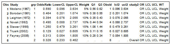
The data is as shown in the table above.
- Study names are included as individual observations.
- Individual study has Grp=1 and Overall has Grp=2.
- The Overall Observations are separated into a separate set of columns to the right.
- Additional columns on the right are created to display the table of values.
Figure 12.2: SAS 9.2 Forest Plot:
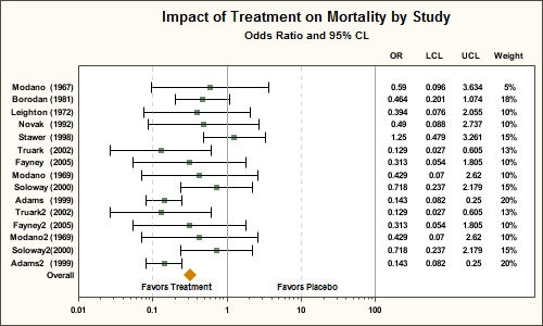
SGPLOT Code:
title "Impact of Treatment on Mortality by Study"; title2 h=8pt 'Odds Ratio and 95% CL'; /*--Create the plot--*/ proc sgplot data=forests noautolegend; /*--Display overall values (Study2)--*/ scatter y=study2 x=oddsratio / markerattrs=(symbol=diamondfilled size=10); /*--Display individual values (Study)--*/ scatter y=study x=oddsratio / xerrorupper=ucl2 xerrorlower=lcl2 markerattrs=(symbol=squarefilled); /*--Display statistics columns on X2 axis--*/ scatter y=study x=or / markerchar=oddsratio x2axis; scatter y=study x=lcl / markerchar=lowercl x2axis; scatter y=study x=ucl / markerchar=uppercl x2axis; scatter y=study x=wt / markerchar=weight x2axis; /*--Draw other details in the graph--*/ refline 1 100 / axis=x; refline 0.01 0.1 10 / axis=x lineattrs=(pattern=shortdash) transparency=0.5; inset ' Favors Treatment' / position=bottomleft; inset 'Favors Placebo' / position=bottom; /*--Set X, X2 axis properties with fixed offsets--*/ xaxis type=log offsetmin=0 offsetmax=0.35 min=0.01 max=100 minor display=(nolabel) ; x2axis offsetmin=0.7 display=(noticks nolabel); /*--Set Y axis properties using offsets computed earlier--*/ yaxis display=(noticks nolabel) offsetmin=&pct2 offsetmax=&pct2; run; |
The key feature is the splitting of the width of the graph into the graph area on the left (on X axis) and the table on the right (X2 axis). Other steps in this graph are as follows:
- The Overall study values are plotted using the first scatter plot with the diamond marker.
- The individual study values are plotted using the second scatter plot.
- The statistics are plotted using 4 scatter plot statements with markerchar on X2 axis.
- The X and X2 axis extents are set using OffsetMin and OffsetMax.
- Macro variables are used to set Y-axis offsets based on number of observations.
- The data is sorted by descending obsid to draw the Overall observation at the bottom.
Full Code: Full SAS 92 Code
Figure 12.3: SAS 9.3 Forest Plot:
In the SAS 9.3 version, we have used the new HIGHLOW plot to draw the Odds Ratio of the individual study observations. The weight of the study is represented by the horizontal length of the box. In the previous example, we did not display the weight of the study. Computation of the weight is up to the user, and is usually based on the sample size of the study.
I also used a reference line to draw faint alternate bands to aid the eye across the width of the graph. A Macro variable is used to set the thickness of this line. This part can also be done the same way in the SAS 9.2 version.
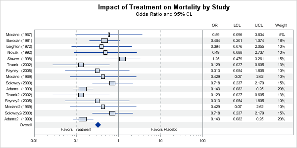
SGPLOT code:
title "Impact of Treatment on Mortality by Study"; title2 h=8pt 'Odds Ratio and 95% CL'; /*--Create the plot--*/ proc sgplot data=forest noautolegend nocycleattrs; /*--Draw alternate reference line--*/ refline studyref / lineattrs=(thickness=&thickness) transparency=0.85; /*--Display overall values (Study2) using scatter plot--*/ scatter y=study2 x=oddsratio / markerattrs=(symbol=diamondfilled size=10); /*--Display individual values (Study) using highLow plot--*/ highlow y=study low=lcl2 high=ucl2 / type=line; highlow y=study low=q1 high=q3 / type=bar; /*--Display statistics columns on X2 axis--*/ scatter y=study x=or / markerchar=oddsratio x2axis; scatter y=study x=lcl / markerchar=lowercl x2axis; scatter y=study x=ucl / markerchar=uppercl x2axis; scatter y=study x=wt / markerchar=weight x2axis; /*--Draw other details in the graph--*/ refline 1 100 / axis=x; refline 0.01 0.1 10 / axis=x lineattrs=(pattern=shortdash) transparency=0.5; inset ' Favors Treatment' / position=bottomleft; inset 'Favors Placebo' / position=bottom; /*--Set X, X2 axis properties with fixed offsets--*/ xaxis type=log offsetmin=0 offsetmax=0.35 min=0.01 max=100 minor display=(nolabel) ; x2axis offsetmin=0.7 display=(noticks nolabel); /*--Set Y axis properties (including reverse) using offsets computed earlier--*/ yaxis display=(noticks nolabel) offsetmin=&pct offsetmax=&pct2 reverse; run; |
Full Code: Full SAS 93 Code
The SGPLOT procedure is ideal for single-cell graphs. To create the effect of a multi-cell graph, I have used the axis splitting technique to create the appearance of a graph cell on the left and table cell on the right. An actual multi-cell graph can be created using the LAYOUT LATTICE statement in GTL, and may really be a better way to do this. I will post an example of that in a subsequent article.


10 Comments
I am curious about the 'reverse' option in the yaxis statement. The study variable is not sorted alphabetically, what is the default order of the yaxis ticker values? What is it to be 'reversed'? It seems that the default order of the yaxis ticker values is from the end of the data set when the variable (study) is a character type, i.e., the last observation plotted at the top of the yaxis and the first observation plotted at the bottom of the yaxis. Is that true?
That depends on the plot type in use. The origin of the graph is at bottom left (cartesean). So, Y axis origin is at the bottom and the values from the data set in data order are displayed bottom to top on the Y axis. Setting REVERSE, flips this order.
Note, HBAR and DOT plots are special case. They set REVERSE on the y axis by default, so the values are plotted top to bottom. Also, the HBAR sets the DISCRETEORDER for Y axis to alphabetical ascending.
Thank you! That solved the mystery for me.
Great code, thank you!
The code creates a beautiful graph. I am using SAS 9.2 (soon to upgrade to 9.3) and I am wondering how you might add color to the confidence intervals and odds ratio mark. I was thinking green for those below 1/statistically significant and red for those above 1/statistically significant. For those without signficance could be blue. Does anyone have any suggestions to an addition to the code listed above?
Thanks,
K
If you mean with SAS 9.3, then you will have more options. See this Forest Plot made using SAS 9.3.
Great plot. Thank you. Is it possible to have the diamond for the Overall level mark the upper and lower values of the confidence interval? ie to stretch from 0.233 to 0.462
I would like to make a forest plot but "grouping" an adjusted analyses and unadjusted analyses on the same outcome right beneath one another, and so forward with several outcomes. Is it possible to change the width between the Y-axis outcomes?
EG.
Stillbirth adjusted
Stillbirth unadjusted
X - adjust
X- undadjust
Z.adjust
Z-undajuste
Hello Sanjay,
I am trying to use your code to generate a forest plot with HR generate from a Cox PH model with Propensity score weights. I was wondering if there is a way to increase the width of the plot so I can clearly display the HR, LCL and UCL estimates? Unfortunately my variable labels are quite long.
proc sgplot data=kids.forest noautolegend;
/*--Display individual values (Study)--*/
scatter y=varname x=hazardr / xerrorupper=ucl2 xerrorlower=lcl2
markerattrs=(symbol=squarefilled);
/*--Display statistics columns on X2 axis--*/
scatter y=varname x=hr / markerchar=hazardr x2axis;
scatter y=varname x=lcl / markerchar=lowercl x2axis;
scatter y=varname x=ucl / markerchar=uppercl x2axis;
scatter y=varname x=pvalue / markerchar=pval x2axis;
/*--Draw other details in the graph--*/
refline 1 10 / axis=x;
refline 0.1 10 / axis=x lineattrs=(pattern=shortdash) transparency=0.5;
*inset ' Favors Treatment' / position=bottomleft;
*inset 'Hazard Ratio' / position=bottom;
/*--Set X, X2 axis properties with fixed offsets--*/
xaxis type=log offsetmin=0 offsetmax=0.35 min=0.1 max=10 minor
display=(nolabel) ;
x2axis offsetmin=0.7 display=(noticks ) label='Hazard Ratio';
/*--Set Y axis properties using offsets computed earlier--*/
yaxis display=(noticks nolabel) ;
run;
You can change the size of the graph using the ODS Graphics statement. If you specify only a WIDTH or a HEIGHT, the other factor is automatically adjusted to maintain the current aspect. So, you only want the width to change, you'll need to specify both the width and the height. Try putting this statement before the SGPLOT call:
ods graphics / width=1000px height=480px;