When was the last time you looked at your own company’s website? I mean, REALLY looked at it? And by that I mean, looked at it from the eyes of someone that knows nothing about your company. Try to do that every so often – it will give you an idea of how your customer engages with your brand.

Now try doing it on a tablet or smartphone. Surf around – try to access content as your customer might: whitepapers, blog posts, demos, videos, etc. Is it a good experience?
Good or bad - no matter what the experience, it should be your concern because your website is a big part of your customers’ web experience. And it’s not a once-and-done endeavor because our customers’ and their expectations are ever-changing, so we need to take steps to evolve the web experience to keep up with our customers.
Here at SAS, my colleague, Scott Calderwood, heads up the team at SAS that focuses on the web experience, and he opened my eyes to the things that he and his team keep in mind as they evolve the SAS website. Knowing the reasons behind recent website changes gives me a new perspective on marketing more holistically that inspired me to write this blog post. In particular, he has a handy-dandy list of five drivers of the modern web experience that I’m happy to share below:
- The mobile customer
 Today’s websites have to be mobile-enabled, and the reason is simple: web usage on mobile devices now exceeds traditional PC usage. And wouldn’t it be nice if it were really that simple, but it's not. It’s also a multi-device world, so different screen sizes and operating systems need to be factored into how you manage the web experience when you think about mobile.
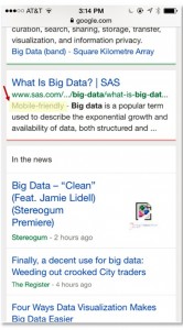
Enter Responsive Design – it’s how you ensure pages render as needed independent of device. It’s a key way to have your website fit all known user experiences, and it’s also an important way to stay relevant for search, because it’s preferred by Google. Google now tags sites as “mobile friendly,” and those results rise to the top of organic results as shown in that screen-shot to the left.
It’s likely the same for your company, but that whole “mobile-friendly” designation is important for us because 15% of our web traffic is now mobile (compared to 1% just 4 years ago), and 66% of that traffic comes from organic search (mostly from Google).
- Long pages that scroll
Count me among the critics of this new aspect of the sas.com website, until Scott reminded me how many of my favorite websites have long pages that scroll. Example #1 is CNN.com – the home page is 6,700 pixels long (about double the length of the average SAS web page). Do I grumble when I visit cnn.com? Nope. Point well taken, Scott!
Having long pages that scroll is not a me-too web design strategy because it’s rooted in actual behaviors that affect all websites. What the iPhone taught us in 2007 is to swipe at screens and to scroll while on web pages. Amazon.com pages average 4,000 pixels long and the About SAS page is 4,600 pixels long (previously 860 pixels long). How is it performing? About 50% of visitors reach the bottom of the page and the average time on page is over 3 minutes long. I’d count that as a positive. Will I stop grumbling now about the length of sas.com pages? Yes, I will. Thank you, Scott!
- Making things easy – Simple and Efficient
I’d call this a lifestyle trend because it cuts across all aspects of our lives and not just web experiences. Our world is complex and we all appreciate anything that helps us get what we need. In terms of web experiences, one of the simplest ways to think of this is that websites should take people from point A to point B more quickly. Part of this is content-driven and the idea that using relevant keywords will take visitors directly to the best fit with what they’re looking for.
This is also a question of site architecture - very simply, fewer clicks are better. And part of this is related to the long pages that scroll – which is particularly important for the mobile web experience. Those pages mean less clicking and there’s no waiting for page loads because the content is threaded together. It helps if we remember that the web is not at all static, and it evolves and it changes with advancements in technology, cultural shifts, generational change and user adoption.
- Today’s modern web experience is visual.
As little as 3 years ago, web pages were all very text-heavy and seemed like they were inspired by the traditional print media. Thankfully, those types of pages are increasingly rare (usually limited to the obligatory terms & conditions window that pops up for wifi access).
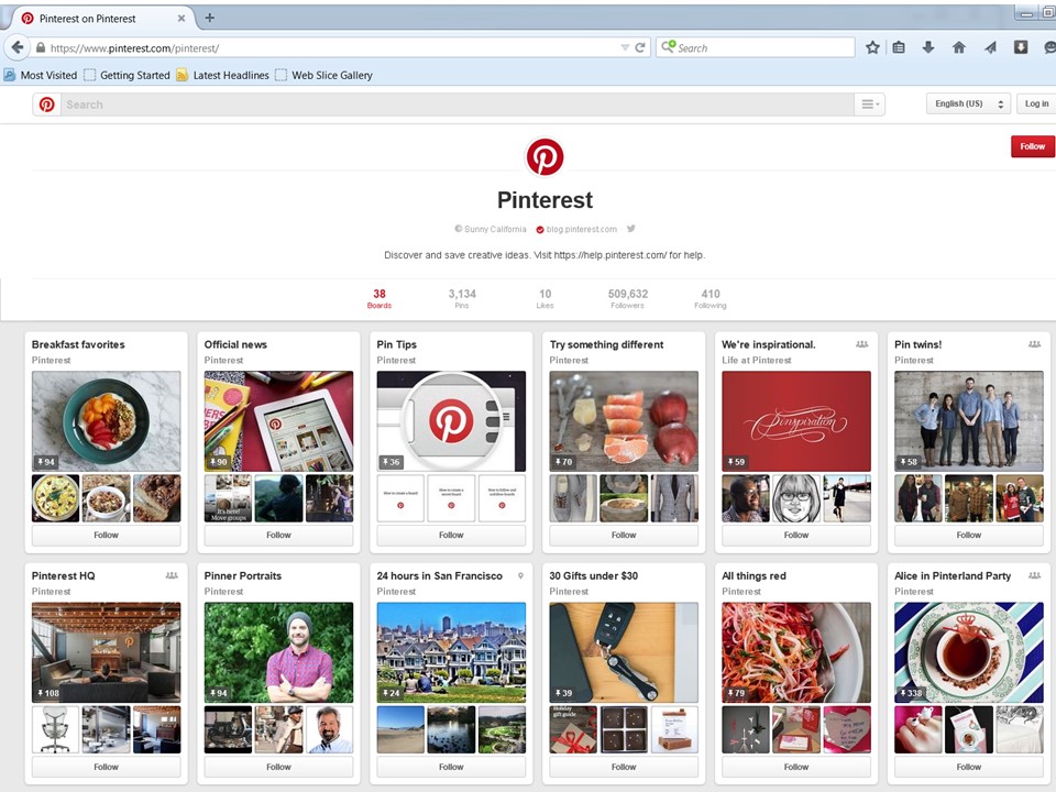
Now, web pages increasingly use card design – with visual elements designed to look like individual cards. To be clearer, card design is like this screen-shot of Pinterest below. Every element has a picture, a title and a very short description. Often there’s a link to take you to more pictures or underlying detail, but it looks like a series of cards.
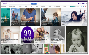
Yahoo.com has been redesigned that same way – with card design.
The beauty of card design is that it allows you to easily adapt to multiple browsers and devices because the cards can aggregate to match the device, and it also accommodates and encourages long scrolling. But perhaps most importantly, it can more easily be personalized.
- The modern web is about personalization.
The reality of today’s web experience, identified in research by Janrain, is that 74% of online consumers get frustrated when online content appears that has nothing to do with their interests. Our customers are clearly becoming conditioned to a personalized web experience and the analytics are already available to make it happen.
Unsure of what that means? Think about how Amazon.com personalizes your visit to that site with their recommendation engine. That personalization is driven by analytics, and it’s also an important reason behind why Amazon is so successful. The good news is that sas.com will soon have those capabilities as well, made possible by our SAS Adaptive Customer Experience solution, which includes personalization capabilities.
As I mentioned before, these insights are helpful for me to think more holistically about my own approaches to marketing. My hope is that you find them helpful as well. Let me know what you think. And as always, thank you for following!


