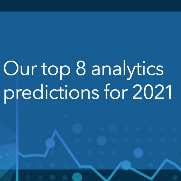
Uncategorized

Analytics | Data for Good
Josh Morgan 0
3 ways data can help homeless youth 

What comes to mind when you think of a “homeless person”? Chances are, you’ll picture an adult, probably male, dirty, likely with some health conditions, including a mental illness. Few of us would immediately recall homeless individuals as family members, neighbors, co-workers and other loved ones. Fewer still are likely aware of how many youths (both minors and young adults) experience homelessness annually.  Homeless youth is a population who can

Analytics | Data for Good
Penny St. Clair-Holmes 0
3 compelling reasons nonprofits are relying on analytics during the pandemic

It’s no surprise that nonprofit organizations providing health-related services are overconsumed during the COVID-19 pandemic, but what about other types of nonprofits? According to CNM President and CEO, Tina Weinfurther, the pandemic has affected nonprofits in different ways. Some are running on fumes, while others have doubled in size and

Analytics | Data Visualization
Rick Wicklin 0
Decile plots in SAS

I previously showed how to create a decile calibration plot for a logistic regression model in SAS. A decile calibration plot (or "decile plot," for short) is used in some fields to visualize agreement between the data and a regression model. It can be used to diagnose an incorrectly specified

1 445 446 447 448 449 2,357