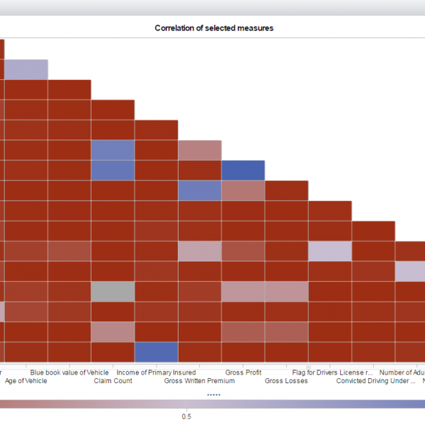
"Correlation does not imply causation.” Does that bring back memories from your college statistics class? If you cringe when you hear those words, don’t worry. This phrase is still relevant today, but is now more approachable and easier to understand. Here at SAS, we use SAS® Visual Analytics to make
Author
~ Coauthored by Varsha Chawla and Dale Rierson ~ Here at SAS, we take our sports seriously. With our corporate headquarters in a city surrounded by major universities and with offices all over the world, it’s no wonder that sports data often becomes the forefront of our demos and projects.
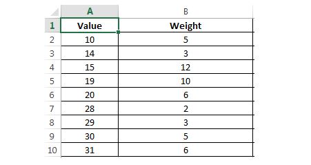
The weighted average calculation is a useful metric that you should be familiar with. The more common calculation of average is the arithmetic mean, which assumes that each data point has an equal weight. Unlike the arithmetic mean, the weighted average takes into account the fact that some data points
Imagine that you’re a large retail firm, in need of projecting sales for the next few months. With the right analytical solution, it can literally take just seconds to have a forecast in place. You drag and drop some variables and can figure out exactly which ones are underlying factors
We’re not sure about you, but we just had the most thrilling, suspenseful, and fun month we’ve had in a while. The 2014 FIFA World Cup may be over, but we’re still amazed by not only the game outcomes and level of athleticism, but also by the wealth of interesting
Do you ever look at a chart or graph and think about what it’s really trying to reveal? All the time, right? Visualizations are useful because they allow us to analyze information much quicker than if we were to look at the raw data by itself. I say this with