All Posts
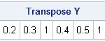

It is common to want to extract the lower or upper triangular elements of a matrix. For example, if you have a correlation matrix, the lower triangular elements are the nontrivial correlations between variables in your data. As I've written before, you can use the VECH function to extract the
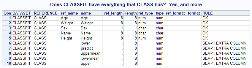

The project that I'm currently working on requires several input data tables, and those tables must have a specific schema. That is, each input table must contain columns of a specific name, type, and length in order for the rest of the system to function correctly. The schema requirements aren't


Recently, there has been lot of uproar and confusion about the Supreme Court ruling on the constitutionality of the Affordable Care Act. Many were surprised by the ruling, and others, while happy it was upheld, are concerned about the constitutional questions that arose due to the way the ruling was
I'm working on a SAS programming project with a large team. Each team member is responsible for a piece of the overall system, and the "contract" for how it all fits together is The Data. For example, I've got a piece that performs some data manipulation and produces several output

Forest plots come in many flavors. An example of a Forest plot using GTL is available on the SAS support web site. Simple forest plots can also be created using SGPLOT procedure by using the SCATTER statement with MARKERCHAR to display data aligned with the plot by study names. One issue

Do you use SAS for analytics and Microsoft Excel for graphs? Why not use SAS for your graphs too?!? Then you could completely automate the entire process in one SAS program, with no manual steps! A lot of people use Excel to create their graphs because "it's what they know." What if somebody
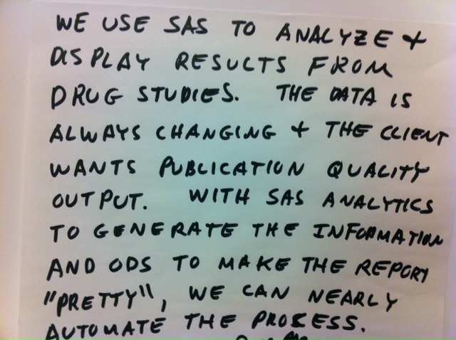

This Post-It Note reminds me of a presentation at SAS Global Forum 2012 about automating reports. Of course, these Post-It Notes always remind me of presentations. This week, instead of pointing you to a bunch of past presentations, I'm going to challenge you to use this note as an idea

Unbelievable: It's already August. When I was a child, my mother used to talk about how time flies when you become an adult, and that I shouldn't wish my life away by always wanting to be older than my years or longing for something that was just beyond my maturity
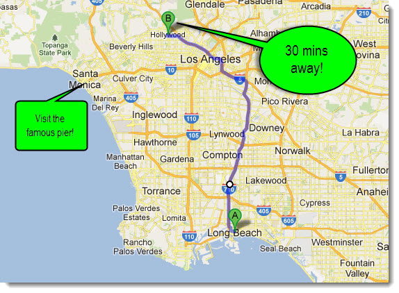

Okay - not exactly Hollywood – but it’s only 30 minutes away – so you could visit during the evening or stay the weekend after the conference to do some star-sightings. Long Beach is outside of Los Angeles and close to Hollywood! It’s not too late to sign up for the WUSS (Western
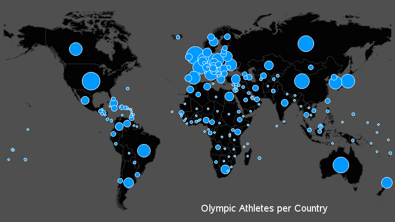
Everyone in the world has their attention turned towards the Olympics this week, so what better topic to tie in to a SAS/GRAPH blog than that?!?! I had seen a graph on the guardian website that I thought was interesting, so I decided to try to create my own (slightly different)
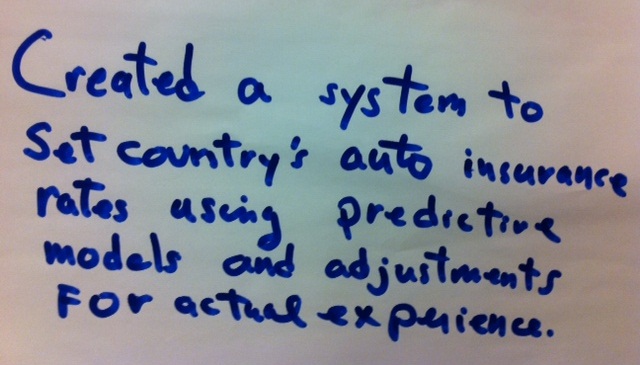
In this Innovation Inspiration, a SAS user has developed the insurance rating plans for a country using predictive modeling. How exciting! Additionally, the system adjusts based upon actual experience. This is quite the accomplishment given the complexity of the ratemaking for even a small geographical territory. The comments section reveal the identity of this innovator. Check it out.
In the Clinical Research domain, there is often the need to display lab values by treatment or test and it is often useful to view this data along with reference lines showing the normal ranges. The obvious way is to use reference lines to denote the normal ranges. SGPLOT Code: proc sgplot data=band; scatter x=x y=y

My sleep patterns are erratic (and somewhat torturous) – they range from sleeping solidly for eight hours a clip to me wandering aimlessly about the house at 3am. Unfortunately, the latter was the reality during the wee hours of Friday, July 20; I was up watching ESPN (my typical late
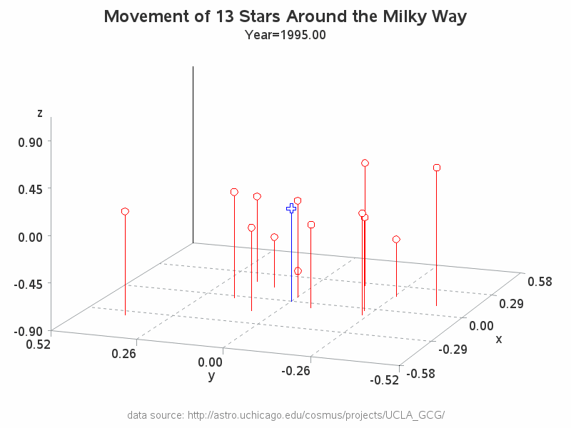
Hopefully you know that a gif animation can be used for more than just showing a cartoon animal doing cute tricks! Being a savvy data-meister, I'm sure you are also aware that you can use gif animations to see how data changes over time. But perhaps you didn't know you could
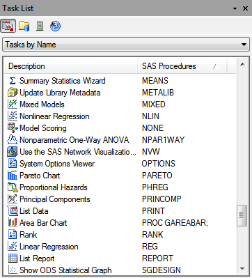
If you need to calculate the mean, sum, standard deviation, or frequency count for a variable, you'll find it pretty easy to accomplish in SAS Enterprise Guide. The corresponding tasks in the menus have names like "Summary Statistics" or "One-way Frequencies". Obvious, right? Often, researchers or students have a quest