Happy New Year to you, your families, and your colleagues! This is the time of year when people make all types of New Year's resolutions. According to the USA.Gov web site, the most popular resolutions are: Lose Weight Volunteer to Help Others Quit Smoking Get a Better Education Get a
Yearly Archives: 2015

Over the Christmas Holidays I saw an graph of agricultural exports to Russia in 2013. The part that caught my eye was the upper part of the graph, showing the breakdown of the trade with Russia as a horizontal stacked bar with custom labels. The value for each region / country

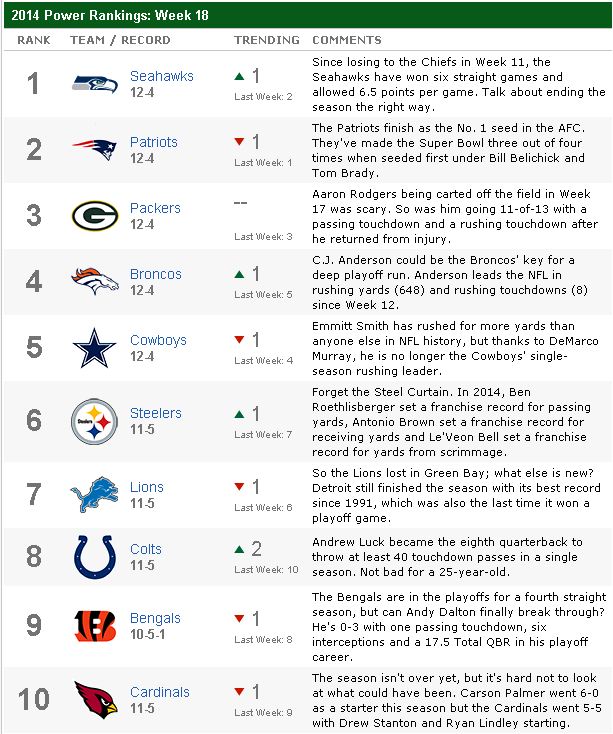
It is January. In the United States, this means NFL playoff time! A perfect time (if you are a geeky SAS/OR guy) to use PROC OPTGRAPH to rank the best teams in the NFL. Ranking Sports Teams Ranking of sports teams is a popular (and controversial) topic, especially in the

I published 118 blog posts in 2014. This article presents my most popular posts from 2014 and late 2013. 2014 will always be a special year for me because it was the year that the SAS University Edition was launched. The University Edition means that SAS/IML is available to all


