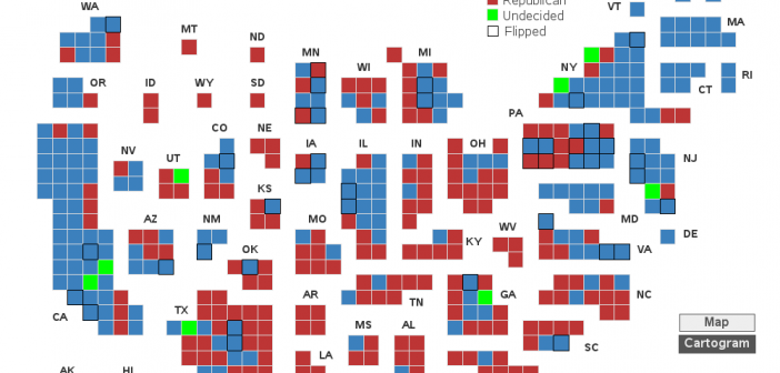
The US 'midterm' elections have finally started to wind down, and we finally have some (mostly) finalized results to study. But what's the best way to visualize who won the US congressional seats in each of the 435 districts? Let's dive into this topic!... Preparation For starters, I couldn't find
Tag: maps
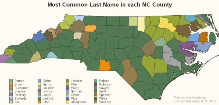
The other day I was playing around with the voter registration data for all ~8 million registered voters in North Carolina (yes - this guy knows how to have fun!), and I got to wondering what last names were the most common. I summarized the data by county, and the
I attended the Scottish Highland Games this past weekend ... nearby in Scotland County, North Carolina! They put on a great event, with kilt-wearing Scotsmen throwing things, bands playing bagpipes, kids dancing, and clans sharing their family history. And to get into the mood for this event, I decided to
Many of the most beautiful areas in the US are owned by the government, to preserve them and allow access for everyone to enjoy them. And most US schools are traditionally closed during the summer, which provides families a great opportunity to go visit state and federal lands (parks, forests,
Showing the most popular jobs in each state is interesting (as I showed in my previous two blogs 1, 2) ... but not that interesting. How about something a little more quirky?!? ... Let's determine the most disproportionately popular job in each state! Their Map I got the idea for
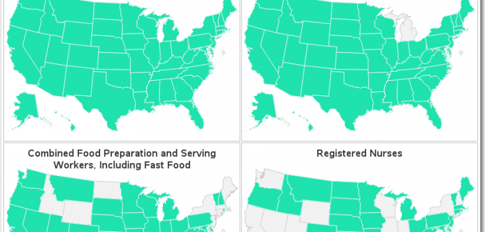
Using small multiples is a neat way to display a lot of information in a small amount of space. But depending on how deeply you want to analyze and scrutinize the data, you need to be careful in choosing just how small you make your small multiples. Let's look at
When I'm at a social gathering, someone always asks what type of work I do. I like to keep my social life separate from my work, therefore I usually give a vague answer such as "software" (and quickly change the topic). How vague or specific is your response? How vague
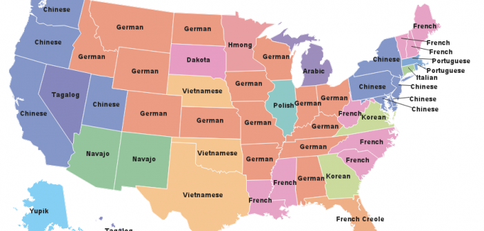
I can recognize several languages when I hear people speaking them (mostly because I lived in the Alexander International Dorm at NC State University). Therefore when I found a map of the most common languages spoken in each US state, it caught my attention, and I decided to try creating my
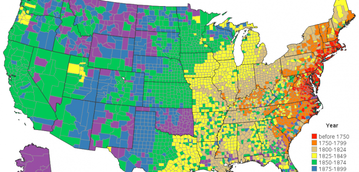
The United States declared independence in 1776, and we celebrate it on July 4th every year. But the land areas that make up the United States today weren't necessarily the same as they were back then. So I thought it would be interesting to create a map showing when each
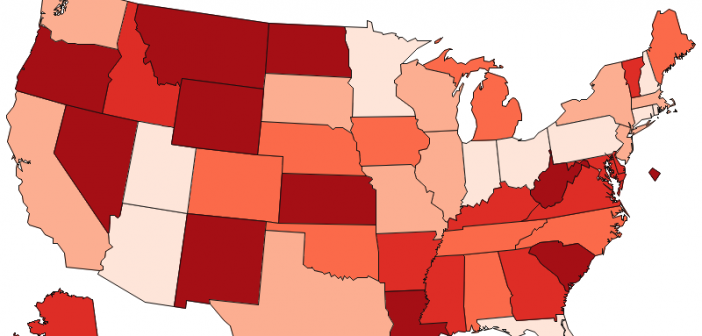
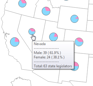
In FiveThirtyEight's Significant Digits section, they recently mentioned that nine states could potentially have 50% or more females in their legislature after the upcoming election. My first thought - I need to see some graphs! They linked to a New York Times article that had some interesting graphs. There was