Many of the most beautiful areas in the US are owned by the government, to preserve them and allow access for everyone to enjoy them. And most US schools are traditionally closed during the summer, which provides families a great opportunity to go visit state and federal lands (parks, forests, monuments, etc). But just how much land does the government own? ... The results might surprise you!
Before we get started with the data analysis, here's a picture from my friends Eva and Todd, who recently visited some of those government lands. Can you guess which state they're visiting? How about the name of the specific location? (Leave your guesses in the comments section!)

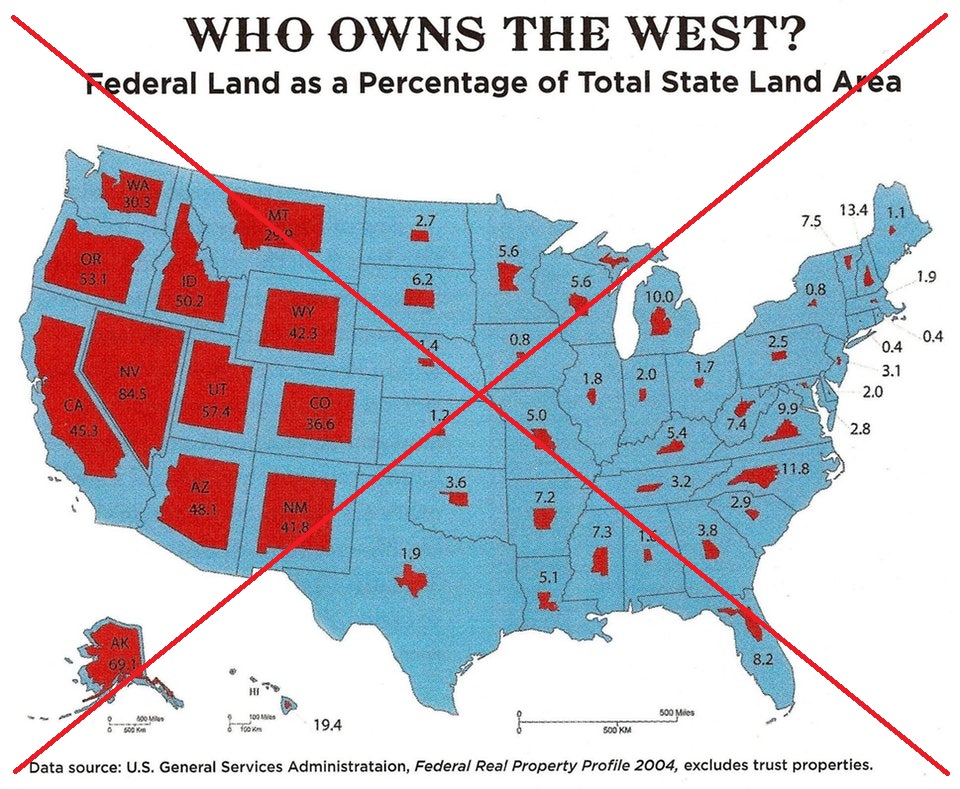
I got the idea for this map from a post on reddit. Their map (below) caught my attention, and there was definitely a 'wow!' factor when I saw how much of the land out west was owned by the government.
Since it was a cool topic, and a cool map design (one which I had never attempted before), I decided to try to create my own version. I started with a search for the raw data - I found several possible sources, but decided to use a table from the Natural Resources Council of Maine (since they had data for both federal and state land).
Here are a few visual changes I made in my map:
- I used a lighter shade of red, so the black text labels would show up better.
- Rather than using blue for the non-government land, I used a very light gray (the red & blue color scheme in the original map made me first think it was some sort of political map).
- I didn't include a distance scale - I don't think it added much to the map, and also the scale for northern states such as Maine is probably different from southern states like Florida.
- And I added HTML mouse-over text (click the map below to see the interactive version with the mouse-over).
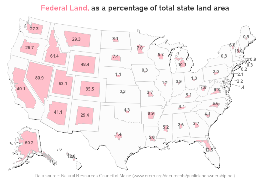
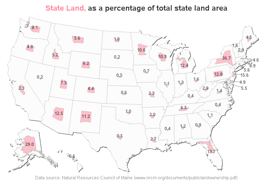
Wow - look how high a % of land in Nevada is owned by the federal government. And look how little land in New York is owned by the federal government. But a comment in the reddit thread hinted that New York's state government owned quite a bit of land ... therefore I thought I might get a more complete picture I created an additional map showing the land owned by the state government. Big surprise to me - 36.7% of New York's land is owned by the state government!
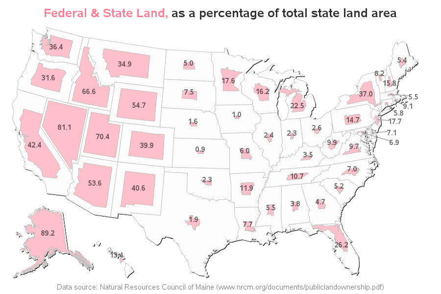
What about a combined map, showing the percent of land owned by either the federal or state government? ... Here it is! And now Alaska has the largest percent.
What percent of the land does the government own in your state? Were there any surprises in this data for you?
How'd he do that? ...
For you programmers and data-geeks, here are some of the technical details of how I created these maps. There isn't an option built-into SAS to create this kind of map, therefore I had to do a bit of customizing. I started with the basic US map, and the dataset containing the centroids of each state. I then created a 2nd copy of the map, to make the smaller/pink versions of the states. At first I tried simply multiplying the X & Y coordinates by the percent of land ownership ... but applying the percent to both the X and Y direction was making the states way smaller than I wanted. Therefore I decided to multiply the X and Y values by the square-root of the percent instead. I then determined the X and Y offset between the center of each state in the original map, and the center of each state in the smaller/pink map, and applied that offset to re-center each of the pink states.
Here's a link to my SAS code, if you'd like to experiment with it, and see if you can adapt it to plot your data.

7 Comments
That is a great view of Horseshoe Bend in the Grand Canyon.
What stands out to me is how stingy Texas seems to be with public lands. I'm from Iowa so I can understand why they have so little (not much to see there).
Yep - Horseshoe Bend!
Awesome fisheye picture of the Grand Canyon in Arizona!
Nice maps, too. Love the color redo and the inclusion of state-owned land.
Yep - Arizona is the state!
Nice maps. More readable annotation due to the lighter red fill, and not such a garish color combination. Background area fill in each state in the original map served no communication purpose. Having ALL of the percent ownership information (Federal, State, Total, and the state name) in the mouseover text box in each of the three web-enabled maps is a maximally helpful feature.
Can you prove that 100 times the map area of landownership within a state divided by the map area of the state is equal to the percent that is annotated on the state? By "map area" I mean the area in the illustration, not the area on the ground.
Thanks.
Can you prove that the map area of Federal or State or FederalPlusState landownership divided by the total map area of the state times 100 is equal to the percent that is annotated on each state? By area I mean the area in the map illustration, NOT the area on the ground. (The areas on the map, state by state, presumably are not proportional to the areas on the ground, state by state, because the states are on a sphere, but the map is projected on a plane.)
Thanks.
These maps are just a visual approximation. :)