What age women do men prefer on dating websites? - Let's have a look at the data...
When I first started using computers in the early 80s, I thought it would be great to have everyone take a survey, and then let computers show you who your best matches were. The computer would be a modern day Cupid! ... I don't know what Cupid really looks like, but here's a picture of a likely candidate my friend Reggie has in his collection of antiques:
Speaking of Cupid & online matchmaking ... one of the most popular free dating websites is called okcupid. Each user provides some personal information when they register (such as age), and optionally answers questions on various topics. Users also have the opportunity to interact with other users in various ways such as sending messages and 'rating' the other users on a scale from 1 to 5 ... and the people who run the website have access to all this data!
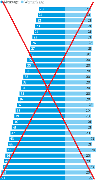
Christian Rudder was one of the founders of okcupid, and was in charge of their analytics team. His job was to "make sense of the data their users created" - what a great job, eh!?! And he has shared some very interesting graphical analyses in blogs and articles. One of his recent articles analyzed how people rated others' profiles on their dating site, and for each age (20-50) it showed the age of the people those users rated the highest.
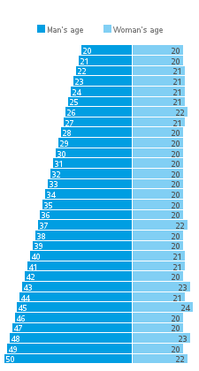
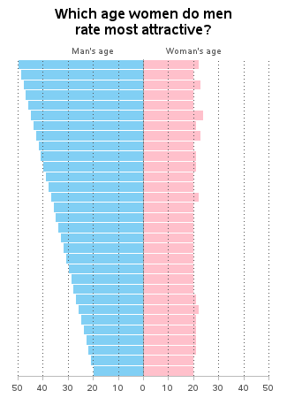
Who did the men rate highest? For almost every age of men, the age of the women they rated highest was around 20. Below is my SAS graph very similar to their graph in the article:
It's an interesting graph, but I had to study it for a few minutes, and read the article, to be able to understand exactly what it was saying. And as usual, I couldn't leave well enough alone, and decided to try to make a few improvements to it...
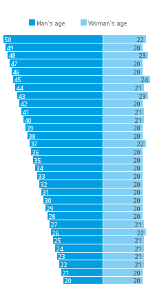
First, I decided to sort the bars so that the older men are at the top (instead of at the bottom), as is customary with population pyramid charts. This small change helped make the graph's layout more familiar to me, and more logical.
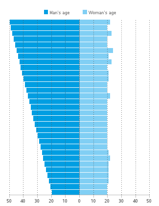
Another thing that needed work - all those tiny numbers on the bars were difficult to read (I'm not getting any younger, you know!). So I decided to go with the more traditional approach of showing the numbers as tick marks along the axis, with reference lines. I made my axis symmetrical around the origin (zero). I also added html hover-text to my html output so you can easily see the exact values for a specific bar (click this link, or the graph below, to see the interactive version with hover-text).
I also decided to make the colors a bit more meaningful/mnemonic ... blue for guys, and pink for girls. And one last enhancement that I think is very important - I added a descriptive title to the graph, so people would know what it represents, without having to read through the text of the article.
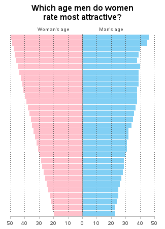
Now that we've analyzed the men's preferences, how about the women?
Hmm ... so the men all rate the 20 year old women the highest, and the women rate men who are close to their own age the highest? Why the difference? What factors might be affecting this data?
I have a few theories, but first I invite you to share your theories in a comment!





14 Comments
I would lay good odds that age-attractiveness relates pretty closely to fertility, as do a number of other attractiveness metrics
You definitely know how to represent data with the help of the graph....!!
The explanation lies with definition difference of the "attractiveness" by men and women.
For men, it is all about look, that is VISUAL. Visuals for women are at their best when women are in their 20s, and that is objective and rated so by all men age groups (and I assume even by all women's age groups).
Women, on the other hand, define attractiveness as something else, perhaps as a reflection of a man on the woman herself. Therefore, high correlation between the woman's age and the age of an "attractive" man.
Pingback: How do men rate women on dating websites? (Part 2) | SAS Training Post
Another idea would be to make a bar graph of the differences instead: how about combining the two last graphs into one, with the left half showing the difference women's age minus the age of the men they find most attractive, and the right half showing the difference between the men's age minus the age of the women they find most attractive. With access to the complete data set one could also show not only the averages, but the distributions as well, although it is not easy to see how this could be done in a perspicuous way. Or: make two XY plots of Y=ages of men being preferred against X=women's ages and Y=ages of women being preferred against X=men's ages.
I like these ideas!
Dr. Allison,
As always, you've done an excellent job improving the story graphically! Being older than you, my eyesight is certainly worse that yours. Even so, when you took the bar value labels off the bars, I found the graph harder to interpret. I looked up and down to find each age, and then I looked up and down for the adjacent bar. Perhaps I'm alone, but having the actual values, however small they may be, on the bars avoids the need to compare bar length with axis value.
Keep up the fine work!
Stuart
Hmm ... I might add the numbers back then!
I would lay good odds that age-attractiveness relates pretty closely to fertility, as do a number of other attractiveness metrics.
Also, attractiveness is not the sole metric by which compatibility is to be judged.
EWWWW. Why would any man be attracted to a someone who could be the same age of his offspring? I'll l be pragmatic and say these ok cupid men do not represent most men.
What a great set of data! It is interesting that until age 30, women rate older men as more desireable. After age 30, they prefer younger men...but only a few years younger. Why this difference? Perhaps many women on the site are looking for a stable long-lasting relationship, and they vote "with their mind" for men who they think would be appropriate partners. According to the data, men tend to be somewhat immature in their view of women and beauty.
It would be interesting to know more background about the data, eh? Wouldn't it be great (from an analytic perspective) to have access to *all* the data from a dating website?!? :)
Ugh. I don't think you want to hear my comments. Your graphs based on the data speaks well enough. I just want to say great work on the graphs. Love seeing you analyze the data and working through making the graphs 'speak' for the data.
I hear exactly what you're saying! :)