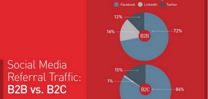
Naomi Robbins has posted a contest, part 1 of which is to submit alternative representations for the following graph: Clearly, usage of two pie charts to represent the share of the B2B and B2C referrals will invite many responses. To create the graph, I took the data shown in the Pie Charts themselves, so we are using percent
Tag: Pie Chart
Naomi's Graph Makeover Contest
How about some pie?
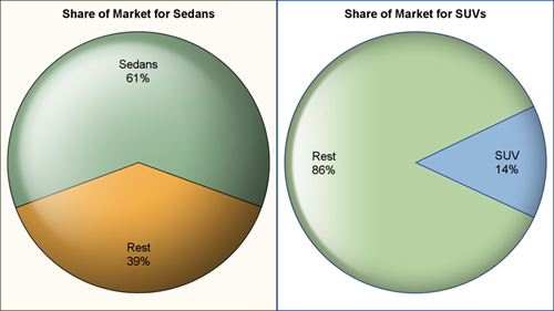
Pie charts have been the subject of some criticism when they are used to compare measures across multiple categories. It is generally accepted that comparison of magnitudes represented as angular measures from varying baselines is not effective. However here are some use cases where a pie chart does quite well. When it comes
Bar chart with response sort
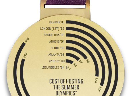
A graph in a recent article in Fortune magazine caught my eye. The graph shows the cost of hosting the Summer Olympics over the past eight events. Here is what I termed the "Medal" graph. Now, practitioners of the art of Effective Graphics would likely find some shortcomings in the graph. Clearly