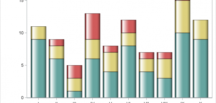
This post shows you how to make a bar chart and an X-axis table; ensure consistency in the order of the legend, bar subgroups, and axis table rows; coordinate the colors for each of those components; and drive all the color choices from an attribute map.
Tag: DiscreteLegend
The Graph Template Language (GTL) provides you the ability to create complex graphical layouts. We have seen how to create a regular grid of cells based on one or more classification variables using the SGPANEL procedure. Each cell contains the same type of plot. This topic was covered in Dan's article on
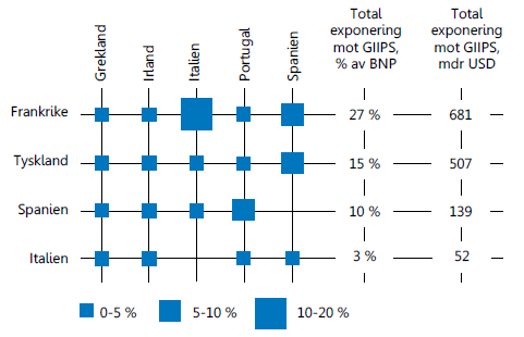
Recently, I came across an interesting graph showing Euro contries bank exposuro to GIIPS countries, as percent of GNP. Here is the graph: I thought I would see how far I can get in making a similar graph using SAS. I made up some data with response values for a Product x
Recently, an interesting question was posed on the previous article on this blog by a reader. Can we use the new DiscreteAttrMap feature to create just a legend with specific entries, with no graph. The question was intriguing enough that I did not wait to ask - "Why?". I just got