Search Results: sgplot series (144)

Data Visualization
Sanjay Matange 2
Graphics with SAS Web Editor

Recently, SAS released SAS Solutions OnDemand for academics.  An academic user who is signed up for this can use the SAS Web Editor application to do all their data analysis over the web using a hosted server at SAS.  This frees up the user from having to install the software on their own computers,

Data Visualization
Sanjay Matange 0
Customizing Plot Appearance

The graphs produced by the SG procedures (and GTL) have a default look and feel designed for the common use cases.  However, everyone has a preference for some special features that make the graphs unique.  Fortunately, extensive customizations can be made to graphs produced by these tools using statement and

Data Visualization
Sanjay Matange 1
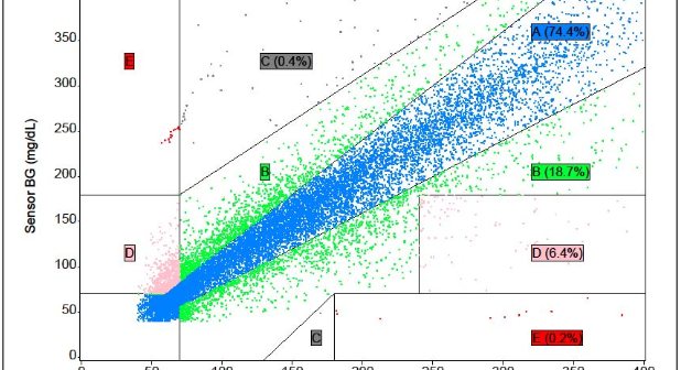
Clark Error Grid Graph

The SAS Global Forum conference last week was awesome.  From the perspective of graphics, there were more papers from uses on graphics and ODS graphics then in recent times.  I will post a summary shortly. One of the interesting papers was "#113-2013 - Creating Clark Error Grid using SAS/GRAPH and Annotate..."

Data Visualization
Sanjay Matange 8
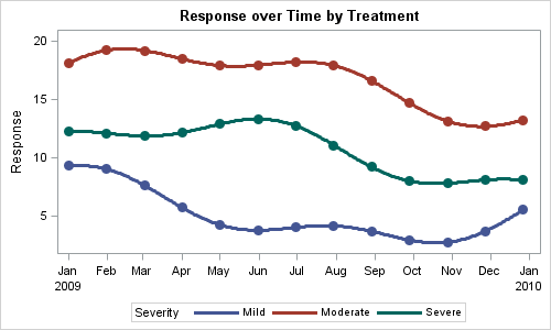
Attribute Maps - 1

You created a graph of Response over Time by Severity where Severity has three levels, "Severe", "Moderate' and "Mild".  How do you ensure that "Severe" is always red in your graph, regardless of the data order? Normally, when creating any graph with a GROUP role, the distinct group values are assigned the style

Data Visualization
Sanjay Matange 3
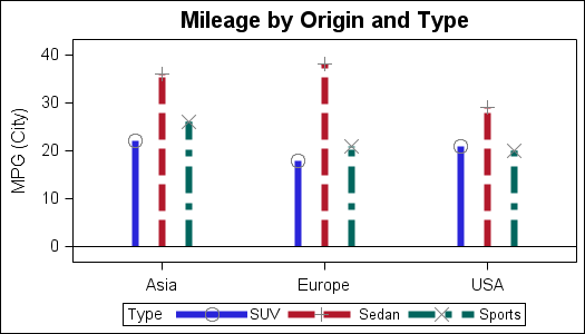
Parametric Bar Charts

A parametric bar chart in SG Procedure and GTL parlance is a simplified version of the regular bar chart, where the data is assumed to be summarized prior to its usage inside the SG procedures or GTL.  So, multiple occurrences of the same category and / or group combination is

Data Visualization
Sanjay Matange 0
Doing more with nbsp

A few weeks ago I wrote an article on using the non breaking space character to prevent stripping of leading and trailing blanks in a string.   Since then, I have discovered a few more instances where the nbsp can be a useful tool for creating graphs. One such instance came up last week

Data Visualization
Sanjay Matange 0
Spark lines made easy

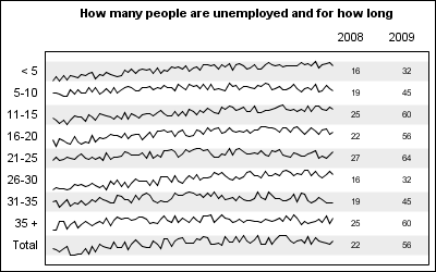
Spark lines, made popular by Edward Tufte, provide a way to visualize trends in a concise space, often inline with the rest of the narrative or data. Previously, I posted an article on Spark Plots in which I created different plot types, some of which included multiple graphs and data in each row.  For such

1 11 12 13 14 15