Often there is a need to display more than one response simultaneously for a bar chart, series plot or a vector plot. SAS 9.40M3 adds the options you need to get such results using two new options COLORRESPONSE and THICKRESPONSE where applicable.
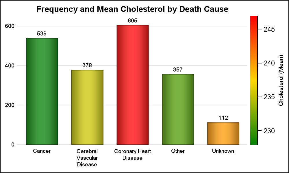 The Bar Chart on the right shows the frequency of subjects by death cause. The height of the bar represents the frequency. The color of the bar is mapped to the mean value of Cholesterol for each bar. Here we can see that the subjects that died of Coronary Heart Disease had the highest mean cholesterol value. We have used the COLORRESPONSE option to specify a different variable and also COLORSTAT=mean.
This graph also uses a slightly different look created by suppressing the y-axis label, line and ticks. Only the values and grids are shown. The x-axis line and ticks are suppressed. Click on the graph for a high resolution display.
SAS 9.40M3 Code for Bar Chart:
title 'Frequency and Mean Cholesterol by Death Cause';
proc sgplot data=sashelp.heart noborder;
vbar deathcause / colorresponse=cholesterol colorstat=mean barwidth=0.7
colormodel=(green gold red) datalabel dataskin=pressed
baselineattrs=(thickness=0);
xaxis display=(noticks nolabel noline) ;
yaxis display=(noticks nolabel noline) grid ;
run;
 Similarly, the SERIES plot also supports setting the color of each line by a response variable, and also display of the thickness of each line by another response variable. The graph on the right shows two response values by time, one for the position of the point on the line and another for setting both color and the thickness. We could have used a third variable for thickness. The color and thickness response values are considered the same for the entire line, so only one value (the first one) is used per line.
SAS 9.40M3 Code for Series Plot:
title 'Values and Response by Treatment';
footnote j=l 'Thickness by Response';
proc sgplot data=seriesResp noborder;
series x=date y=val / group=drug colorresponse=resp colormodel=(green gold red)
thickresp=resp;
xaxis display=(noticks nolabel noline) grid ;
yaxis display=(noticks noline) grid ;
run;
 Color and Thickness response are supported for Bar, Series, Step, Vector plots. The graph on the right shows a VECTOR plot showing the blood pressure range for each subject in the study by Cholesterol. The thickness and color of the vector are mapped to the cholesterol value. Of course, you could map color and thickness to different variables for a more expressive graph.
SAS 9.40M3 Code for Vector Plot:
title 'Blood Pressure Range by Cholesterol';
footnote j=l 'Thickness by Cholesterol';
proc sgplot data=sashelp.heart(where=(ageatstart > 61)) noborder;
vector x=cholesterol y=systolic / xorigin=cholesterol yorigin=diastolic
colorresponse=cholesterol colormodel=(green gold red)
thickresp=cholesterol;
xaxis display=(noticks noline) grid ;
yaxis display=(noticks noline) grid label='Blood Pressure';
run;
Full SAS 9.40M3 Code: ResponseColor


7 Comments
Very elegant ways.
Love it. I'm curious ... does gradlegend also give us control of placement? (In the vector plot example, running it along the horizontal axis would improve readability of the graph.)
Yes, you can set the location for the gradient legend.
How do you set the location for the gradient legend? I have tried KEYLEGEND and other options but can't get it to move.
There is a separate statement GRADLEGEND to set options for this component.
Very nice! I'm looking forward to the next upgrade.
Pingback: Series Plot with Response Color Segments - Graphically Speaking