Returning from my recent visit to India, I was reading an article that included a graph with a series plot where the color of the series itself changed based on the Y response. Now, for sure, the SAS 9.40M3 SERIES plot in the SGPLOT procedure supports color response, but that applies to the entire curve. If the series has multiple groups, the curve for each group can have a color by a response variable. I discussed this features in the article about Response Color and Thickness.
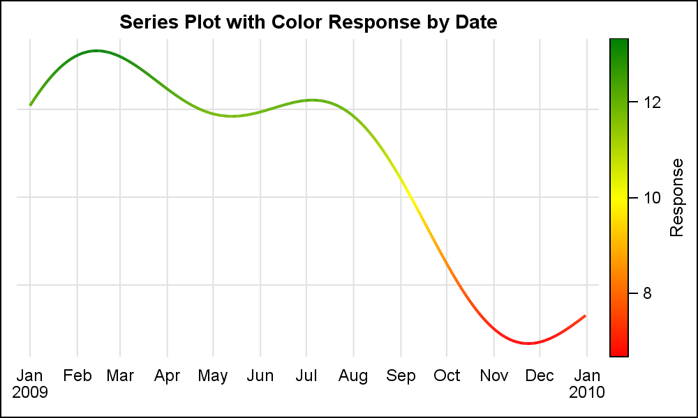 But what if you want to vary the color of the segments of the single series itself based on some response value, say the Y variable as shown in the graph on the right? How would we do this?
The SERIES plot statement in SGPLOT cannot create such a graph, nor can GTL. But, I created the graph on the right using SGPLOT. How did I do this?
The answer is using a VECTOR plot. The series plot needs data with two columns for (x, y), and a number of observations that decide the shape of the curve. I added two additional columns (xp, yp), which includes the previous (x, y) location. So, now I have a data set with a series of observations having the data for short segments of the series plot as vectors. Then, I use these four columns to draw the curve shown above, the shape of the curve is identical to the shape if drawn by the SERIES plot statement.
title 'Series Plot with Color Response by Date';
proc sgplot data=series subpixel noborder;
vector x=date y=a / xorigin=Prevdate yorigin=preva noarrowheads
colorresponse=a colormodel=(red yellow green) lineattrs=(thickness=2);
xaxis display=(noline noticks nolabel) grid;
yaxis display=none grid;
run;
The VECTOR plot statement supports the COLORRESPONSE option. We have used the same variable "A" as used for the Y role, so we can see the color varies correctly by the height Y height of the plot in the graph in the graph above.
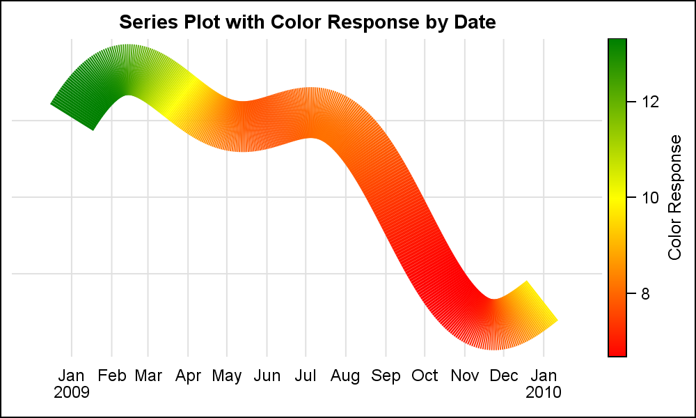
 Clearly this is even more useful if the color variable is a different measure. In the graph on the right, I have used a different variable "C" for the color response to view the variation of another measure by the (x, y) point on the series. For the graph on the right, I have increased the thickness of the plot. Click on the graph for a higher resolution graph.
Now, to be sure, this is a somewhat of a "poor man's" variable color series plot. When viewing the higher resolution image, some of you may have seen an artifact in the thicker line. Since the curve is made up of short vector segments, each segment does not join up correctly at the edges as the curve thickness increases.
 To illustrate this more clearly, I have increased the thickness to 40 pixels for the graph on the right. Some artifacts are visible in the sharp curved region of the curve as in the top left green segment. View the graph in higher resolution, and you will see this clearly. The case on the right is an extreme case for illustration purposes. For most use cases, a moderately thick line may work.
For the motivated reader, there is a way to get around this artifact using the POLYGON plot instead of a VECTOR plot. The idea is to create individual polygons for each segment, by computing the points at each corner of the polygon using the normal vector half way between the two segments. You would use the same technique I used in the previous article for drawing curved links in the diagram.
Anyone wants to post such a solution?
Full SAS 9.40M3 code: Series_With_Response_Color

2 Comments
Hello,
I can not use this code in my SAS (9.4 TS Level 1M1)
It gives an error by the "colorresponse" and "colormodel" options
COLORRESPONSE option for both VECTOR and SERIES plots were added with SAS 9.40M3.