 As Sheldon Cooper would say, this is the first episode of "Fun with Charts". I did not find a cool term like "Vexillology" and "Cartography" is taken by map making, so let us go with "Chartology".
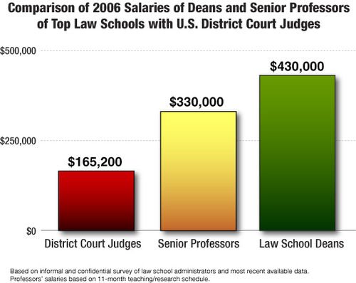
Yesterday, I saw a couple of interesting bar charts as shown on the right. I thought this may provide for some fun creating different appearances with Bar Charts using SAS 9.4M2.
The first graph uses a color gradient from a lighter color at the top to a darker shade at the bottom, though the one in the middle seems to have a reddish tinge.
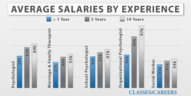
The second graph on the right uses an interesting way to label the categories. Let us see what we can do with the new features added to SGPLOT procedure with SAS 9.4M3.
 The SGPLOT procedure supports new features including the ability to have a gradient fill for bars and histogram bins. We will use this feature to create these charts. The VBar statement can be overlaid with itself as long as the category and group classifications are the same. We can use this feature to create the first chart.
The second graph needs a little more creative construction, using a mixture of plots. The VBarParm statement can be freely combined with any other basic plot to create more interesting combinations. We will use that to create the second graph.
 The Bar and Histograms now support a FillType=Gradient option, that fills the bar with the bar color that is fully opaque (or the specified fill transparency) at the top, and gradiates to transparent at the bottom. Some of the background (wall) color shows through, including anything behind the bar, such as grid lines.
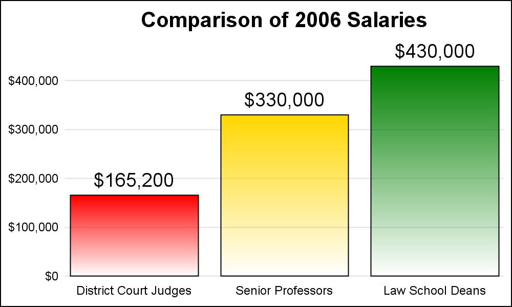
For the graph on the right, I have used a VBAR with groups set to the same as the category to get the bars colored by the category. I have set FillType=Gradient which results in the nice gradient from saturated color at the top to the transparent at the bottom. The code is shown below. Click on the graph for a higher resolution image.
SAS 9.4M3 SGPLOT Code:
proc sgplot data=Law_Salaries nowall noborder noautolegend;
  styleattrs datacolors=(red gold green) datacontrastcolors=(black);
  vbar profession / response=salary group=profession groupdisplay=cluster
                    filltype=gradient baselineattrs=(thickness=0)
                    datalabel datalabelattrs=(size=14);
  xaxis discreteorder=data display=(noticks nolabel noline);
  yaxis display=(noticks nolabel noline) grid;
  run;
 Note in the program above, we have set a few wall, border and axis options to get this appearance. GroupDisplay is set to "Cluster" to get the data labels on each bar. Also note the grid lines are visible through the bar towards the bottom as the transparency increases. If this is undesirable (as in this case), we can address this by placing a VBar behind it with opaque white bars as shown in the graph on the right.
Only thing remaining to do now is to change the gradient to transition to black instead of white at the bottom. The way to do this is probably obvious to you. Instead of an opaque white backing VBar, use black.
 Here is the final result, with bars gradiating to black and using the "Matte" skin. Except for the slightly reddish tinge at the bottom of the 2nd bar, this is pretty close, I think.
Now, let us turn to the second example. This graph is relatively straightforward, except for the interesting way the category values are labeled along the side of each cluster. Also, the bar values are inside the bar at the top end, rotated vertically.
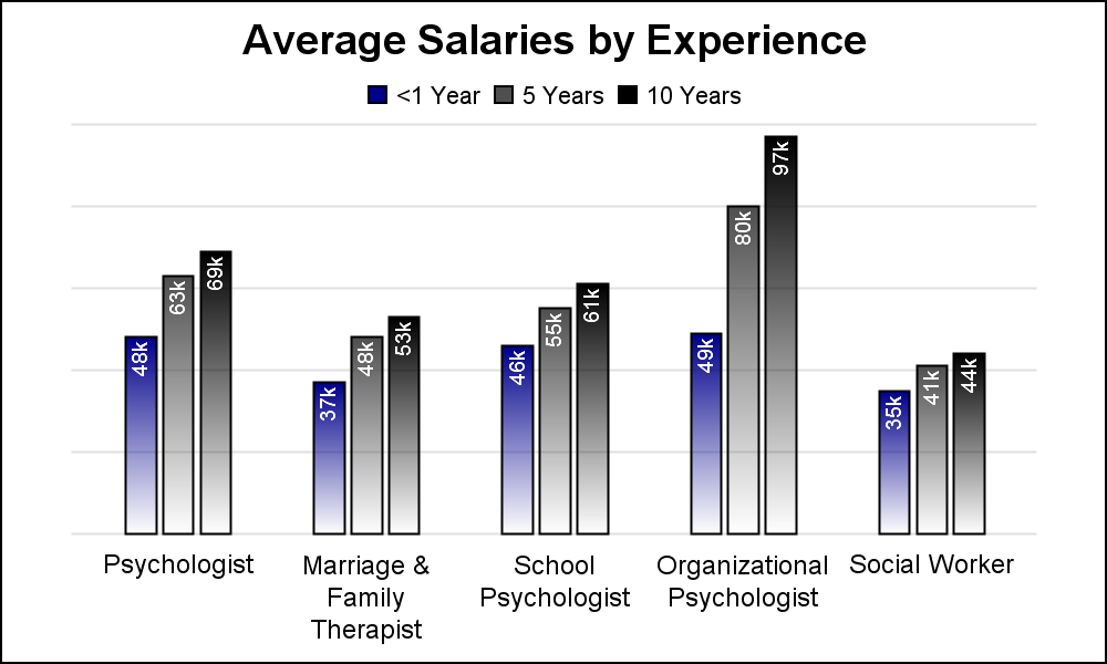 We will start by creating a basic cluster grouped bar chart using the VBarParm statement as shown on the right. We used VBarParm because we know we will need to use other statements to do the special effects, and VBarParm allows us to layer it with other plots.
The graph on the right really gets the information across just fine, with the nice split tick values on the x axis. This part is all done by the single VBarParm. We have overlaid on each bar a new TEXT statement to display the bar values at the top of the bar, but inside the bar. The values are rotated vertically, and aligned such that the right edge of the text is along the top of the bar. Note the use of "Backlighting" to ensure the text is visible on any background color.
To add the unique category labeling, we use a second text plot. We offset the bars to the right by using DiscreteOffset=0.2, and ClusterWidth=0.6. This places the three bars offset to the right. Then, we overlay a TEXT statement with the following settings:
text x=profession y=zero text=profession / rotate=90 position=right textattrs=(size=12 color=darkblue) contributeoffsets=none discreteoffset=-0.2; |
 The resulting graph is shown on the right. In the syntax for the TEXT plot, note the three required parameters, X, Y and Text. The text from the column is placed at the (x, y) location in the graph. The plot is offset to the left by 20%, the text is rotated 90 degrees with position of right (meaning, text is on right of the location prior to rotation). The text color is set to dark blue just to add some interest.
The overlaid bar labels use black text, again with backlight. Back light works by default, and darkens or lightens the background based on the text color so that the text is clearly visible.
Over the years we have found ourselves using the Scatter with MarkerChar to insert textual information in a graph. So, it is about time text gets its own statement with options to customize the text.
Note. Everything is done using plot statements. No annotation is required.
Full SAS 9.4M3 SGPLOT code: BarCharts


