The SAS Global Forum conference last week was awesome. From the perspective of graphics, there were more papers from uses on graphics and ODS graphics then in recent times. I will post a summary shortly.
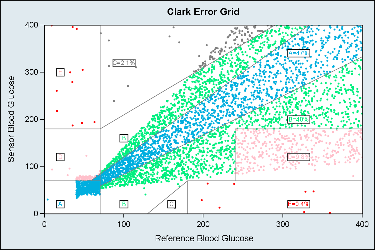
One of the interesting papers was "#113-2013 - Creating Clark Error Grid using SAS/GRAPH and Annotate..." by Yongyin Wang and John Shin of Medtronic Diabetes. Here is the graph included in the paper:
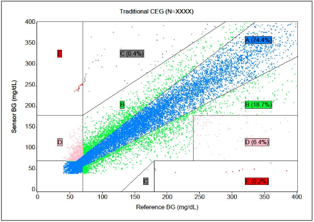
This graph is created using SAS/GRAPH GPLOT procedure with Annotation to draw the lines representing the zones and the labels in the graph. So naturally, I wanted to see how far I can get using the SGPLOT procedure without any use of annotation.
Step 1: Create the data for drawing the zones:
The zone lines (or polygons) can be drawn using the SERIES plot. Here is the graph. I used the coordinates from the paper. The grid lines are drawn using the SERIES plot with a group option. See full code for the data. Click on graph to see full resolution image.
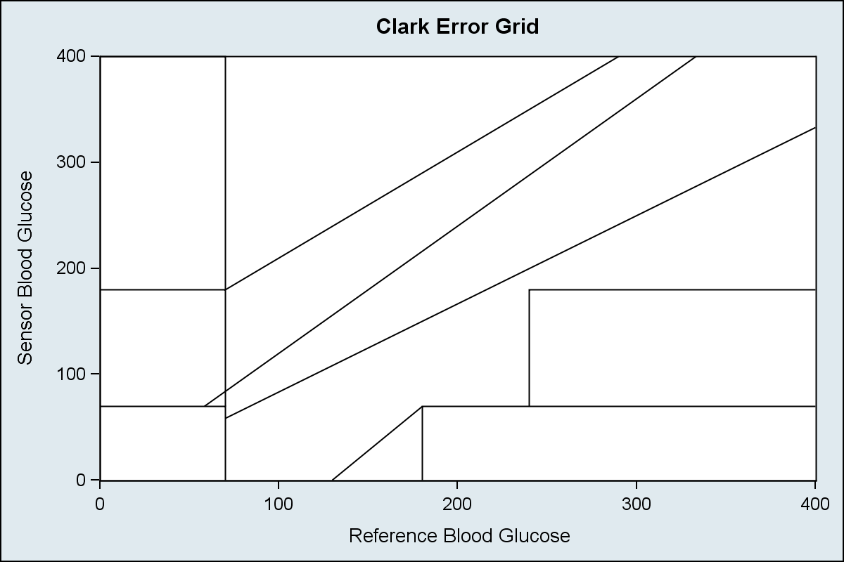
SAS 9.3 SGPLOT code:
title 'Clark Error Grid'; proc sgplot data=grid noautolegend dattrmap=attrmap; series x=rfbg y=sbg / group=id lineattrs=graphdatadefault(color=gray) nomissinggroup; xaxis min=0 max=400 offsetmin=0 offsetmax=0 label='Reference Blood Glucose'; yaxis min=0 max=400 offsetmin=0 offsetmax=0 label='Sensor Blood Glucose'; run; |
Step 2: Generate data and assign zones for each point.
Since I do not have access to the real data, I resorted to some tricks to simulate random data with a distribution that loosely follows the real data in the graph. I used YongLin's equations to assign the zone values. I also like Robert's idea of defining the map polygons, and using the proc GINSIDE to find the points in the polygons. Here is the graph with the grids and simulated data using default group attributes. The scatter plot with GROUP=zone is used to plot the data.
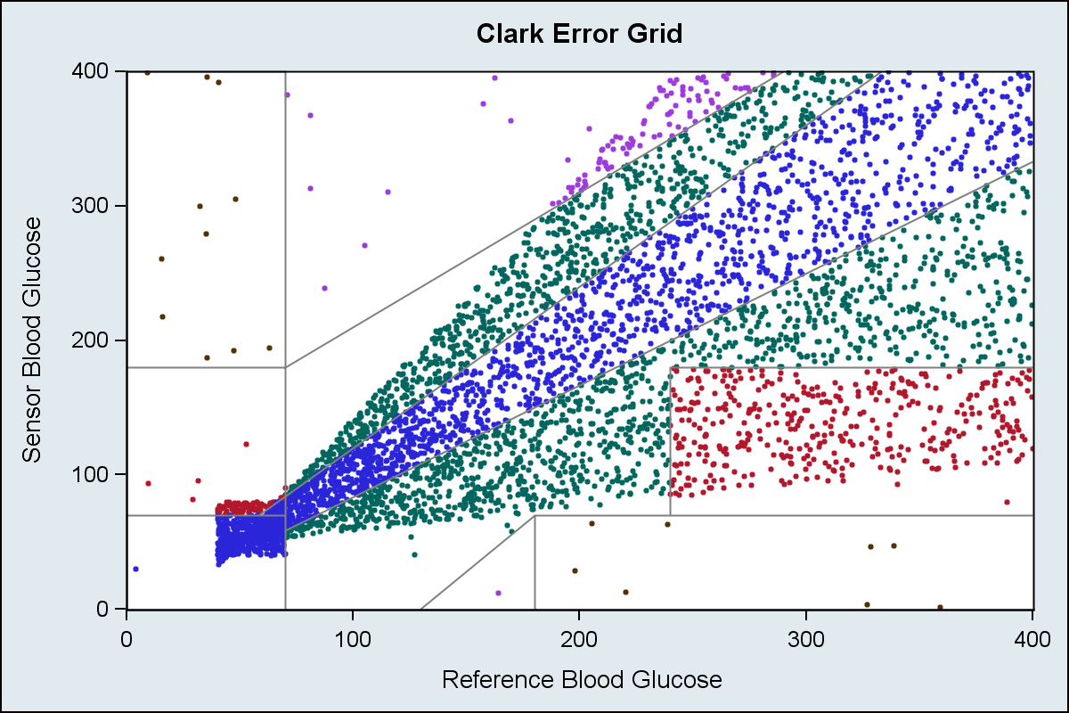
SAS 9.3 SGPLOT code:
title 'Clark Error Grid'; proc sgplot data=plotZone noautolegend; scatter x=x y=y / group=zone markerattrs=(symbol=circlefilled size=3); series x=rfbg y=sbg / group=id lineattrs=graphdatadefault(color=gray) nomissinggroup; xaxis min=0 max=400 offsetmin=0 offsetmax=0 label='Reference Blood Glucose'; yaxis min=0 max=400 offsetmin=0 offsetmax=0 label='Sensor Blood Glucose'; run; |
Step 3: Count the points in each zone, and use same color scheme as Yongyin's graph.
An Attribute Map is used to color the markers in each zone using the color scheme Yongyin's graph uses. Points in each zone are counted, and the percent values shown in each zone using the SCATTER plot with MARKERCHAR option.
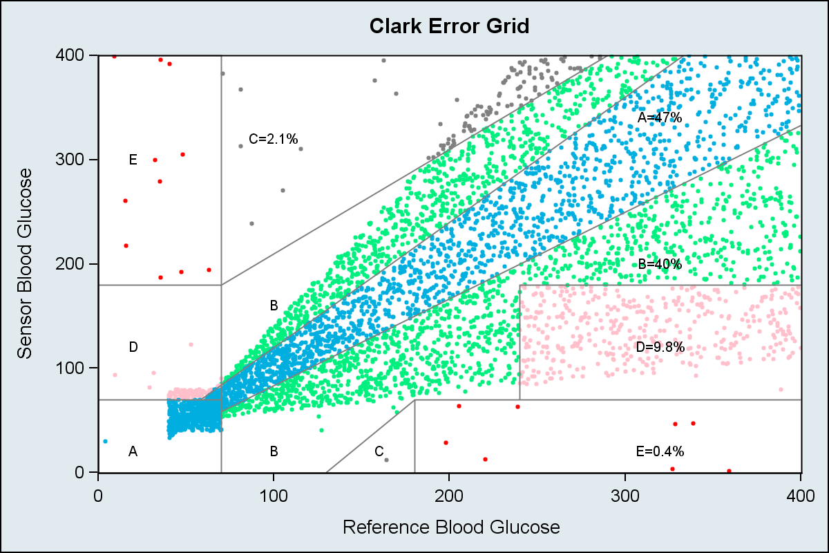
SAS 9.3 SGPLOT code:
/*--Define Attributes Map--*/ data attrmap; length id $1 value $1 markercolor $10; id='A'; value='A'; markercolor='cx00afdf'; linecolor='cx00afdf'; output; id='A'; value='B'; markercolor='cx00ef7f'; linecolor='cx00ef7f'; output; id='A'; value='C'; markercolor='gray'; linecolor='gray'; output; id='A'; value='D'; markercolor='pink'; linecolor='pink'; output; id='A'; value='E'; markercolor='red'; linecolor='red'; output; run; /*--Draw the Graph--*/ title 'Clark Error Grid'; proc sgplot data=plotZoneCount noautolegend dattrmap=attrmap; scatter x=x y=y / group=zone attrid=A markerattrs=(symbol=circlefilled size=3); series x=rfbg y=sbg / group=id lineattrs=graphdatadefault(color=gray) nomissinggroup; scatter x=xl y=yl / markerchar=label attrid=A; xaxis min=0 max=400 offsetmin=0 offsetmax=0 label='Reference Blood Glucose'; yaxis min=0 max=400 offsetmin=0 offsetmax=0 label='Sensor Blood Glucose'; run; |
Step 4: Draw boxes around the numbers.
We use the HIGHLOW plot statement with TYPE=BAR to draw white boxes with outline around each label so each label can be seen clearly.
SAs 9.3 SGPLOT code:
/*--Draw the Full Graph with text background--*/ ods graphics / reset antialiasmax=5700 width=6in height=4in imagename='ClarkErrorGrid_4'; title 'Clark Error Grid'; proc sgplot data=plotZoneCount noautolegend dattrmap=attrmap; scatter x=x y=y / group=zone attrid=A markerattrs=(symbol=circlefilled size=3); series x=rfbg y=sbg / group=id lineattrs=graphdatadefault(color=gray) nomissinggroup; highlow y=yl low=low high=high / group=zone type=bar outline fill fillattrs=(color=white) lineattrs=(pattern=solid thickness=1 color=black) ; scatter x=xl y=yl / markerchar=label group=zone attrid=A; xaxis min=0 max=400 offsetmin=0 offsetmax=0 label='Reference Blood Glucose'; yaxis min=0 max=400 offsetmin=0 offsetmax=0 label='Sensor Blood Glucose'; run; |
If needed, the label backgrounds can be colored by zone. As we can see, this entire graph can be created using SGPLOT procedure, without need for any annotation. Different plot statements can be used to achieve the results you need. Of course SGANNO feature is available, but I try to avoid it as much as possible.
As usual, we learned something from this exercise. We need a way to make the text labels in the graph clearly legible, without hiding any of the data (as far as possible). Drawing a white box is one option, but doing this automatically will be useful.
Full SAS 9.3 Code: Clark_Error_Grid


1 Comment
Sanjay,
You missed a condition in the paper that you refer to at the beginning of this blog.
https://support.sas.com/resources/papers/proceedings13/133-2013.pdf
In page 4, there is one more condition to judge A:
if (are<=20) or (_RFBG_<70 and _SBG_<70) then A=1;
You missed condition "(are<=20)" that conduct to your result is not exact right ! Hope you can change your code .