When comparing results by category and group, putting the items to be compared close together usually leads to a graph that is easier to decode. Take the case of the data (simulated) shown below.
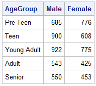
Here we have population by age group and sex. To compare the population by sex, it is useful to view this as a bar chart with values for male and female placed side-by-side groups, shown below. Click on the image to see full size view.
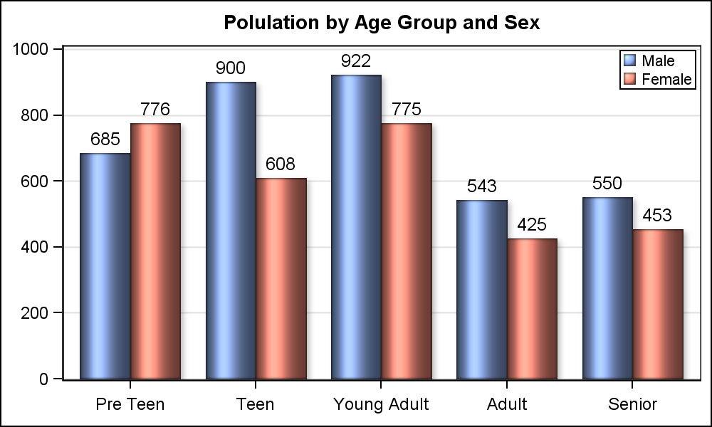
In the data above, we don't have a group variable, but rather two separate columns of data, one for Male and one for Female. With a group type data, we would just use a VBAR (or VBARPARM) statement with a group role and GroupDisplay of Cluster. However, in this case, we can use two VBARPARM statements, with DISCRETEOFFSETS to place the values side by side.
SAS 9.3 Grouped Bar Chart Code:
title 'Polulation by Age Group and Sex'; proc sgplot data=pop; format male female positive.; vbarparm category=agegroup response=male / discreteoffset=-0.2 barwidth=0.4 dataskin=sheen datalabel=male datalabelattrs=(size=10); vbarparm category=agegroup response=female/ discreteoffset= 0.2 barwidth=0.4 dataskin=sheen datalabel=female datalabelattrs=(size=10); yaxis values=(0 to 1000 by 200) display=(nolabel) grid; xaxis display=(nolabel); keylegend / location=inside position=topright across=1; run; |
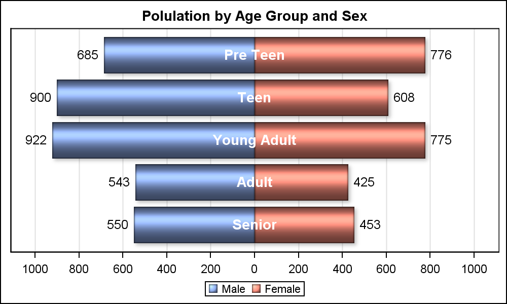
Butterfly Plot:
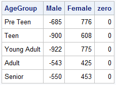
In cases, where there are only two unique values for the group variable, or we are plotting two columns as in this case, a popular alternative is the Butterfly Plot. In this arrangement, the two values are arranged on each side of the axis. Data set and graph are shown below.
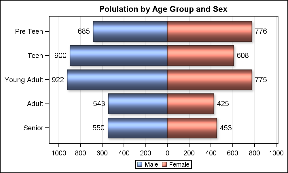
Here are the steps to create this graph using SGPLOT procedure:
- Change all values for the male column to the negative of the original value.
- Use two HBARPARM statements, one to plot the values for male and one for female.
- Set DataLabel option with text attributes to display the values.
- Use a picture format, so the negative values are shown as positive numbers.
SAS 9.3 Butterfly Plot Code:
title 'Polulation by Age Group and Sex'; proc sgplot data=ButterFly; format male female positive.; hbarparm category=agegroup response=male / dataskin=sheen datalabel=male datalabelattrs=(size=10); hbarparm category=agegroup response=female / dataskin=sheen datalabel=female datalabelattrs=(size=10); xaxis values=(-1000 to 1000 by 200) display=(nolabel) grid; yaxis display=(nolabel); run; |
It would be nice if we could place the Y-Axis values in the middle of the graph, along the x=zero line. The next best thing is to place the y-axis values in the middle of the bar as shown in the graph below:
SAS 9.3 Butterfly Plot code with center Y tick values:
title 'Polulation by Age Group and Sex'; proc sgplot data=ButterFly noautolegend; format male female positive.; hbarparm category=agegroup response=male / dataskin=sheen name='m' fillattrs=graphdata1 datalabel=male datalabelattrs=(size=10) transparency=0; hbarparm category=agegroup response=female / dataskin=sheen name='f' fillattrs=graphdata2 datalabel=female datalabelattrs=(size=10) transparency=0; scatter x=zero y=agegroup / markerchar=agegroup markercharattrs=(size=11 weight=bold color=white); keylegend 'm' 'f'; xaxis values=(-1000 to 1000 by 200) display=(nolabel) grid offsetmin=0.05 offsetmax=0.05; yaxis display=(noticks novalues nolabel); run; |
I used an overlaid SCATTER plot with the MarkerChar option using the "Zero" column. I turned off the Y-Axis display. It mostly works.
What if one wants real Y-Axis values in the middle? How would you do it SGPLOT procedure? Clearly, you can place the values using the scatter plot technique, but how would you create the empty space in the center to place the values and adjust the x axis tick values? Can you do it without using Annotate?
I would be very interested to hear your ideas.
Full SAS 9.3 Code: ButterflySAS93_Code
PS. Personally, I would prefer the cluster grouped bar chart. I can't see the benefit of the butterfly arrangement. Why would you use a butterfly plot instead of a bar chart?


3 Comments
I don't like the butterfly plot. It's prettier, the kind of thing I would expect Excel to produce. But personally I don't find it informative as a clustered group bar chart. It's difficult to assess the magnitude of difference when plotted as a butterfly chart compared to the other way.
i'm stil on 9.2, so i think sgplot doesn't admit hbarparm. so, except for the scatter, what one could do is add an arbitrary value to the height of the bar on each side, and then formatthe x-axis accordingly. then, add whitebars of the height equal to the arbitrary value. would have to adjust the outline colors too (no shown). and as 9.2 doesn't allow scatter to mix with hbar, I'm not able to draw the scatter.
This is where I'd go with GTL and use 3 columns, 1 for the males, 1 for he scatter, and 1 for the females. But here's as far as I got with 9.2, not using anno, and I think using hbarbarm and scatter it would work in 9.3:
data plots;
input ageg $ male female zero;
whitepos=200;
whiteneg=-200;
cards;
preteen -685 776 0
teen -900 608 0
ygadult -922 775 0
adult -543 425 0
senior -550 453 0
run;
data plots;
set plots;
male=male-200;
female=female + 200;
run;
proc format;
value m
200 = '0' 400='200' 600='400' 800='600' 1000='800' 1200='1000'
-200 = '0' -400='200' -600='400' -800='600' -1000='800' -1200='1000'
other = ''
;
proc sgplot;
hbar ageg / response=male;
hbar ageg / response=female;
hbar ageg / response=whitepos fillattrs=(color=white);
hbar ageg / response=whiteneg fillattrs=(color=white);
xaxis values=(-1200 to 1200 by 200) display=(nolabel) grid;
yaxis display=(nolabel);
format male female m.;
run;
quit;
Pingback: Comparing SAS/GRAPH® 9.4 capabilities with SAS/GRAPH® Version 6 - SAS Users