 I remember my grandparents talking about how hard things were for them growing up. They would say, “Things were so bad that we had to walk uphill, both ways, in the freezing snow to get to school.” It was always hard for me to relate to these statements because the school bus picked me up at the end of my driveway. Fast forward to today and people are riding on hoverboards. Through the years, advancement in transportation has made it easier for us to get where we need to be.
SAS/GRAPH® Version 6
The evolution of SAS/GRAPH® is similar. In the earlier days of SAS® software, during Version 5 and 6 of SAS/GRAPH, I understood how difficult it was to create some of the graphs that customers wanted. A customer recently asked whether I could send him the code that produced the graph below, which he found in the SAS/GRAPH® Software: Reference, Volume 1 Version 6 Edition:
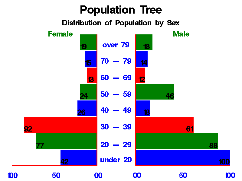
In Version 6, the only way to create this graph, referred to as a butterfly chart, was by using SAS/GRAPH and the Annotate facility. The annotation statements added over 60 lines of code to the program.
Below is a snippet of the Version 6 program that created the bars on the left side of the graph.
Click this link to see the entire Version 6 program.
/* female bars on left */ %bar(39.8, 10.5, 25.0, 20.0, blue, 0, solid); %bar(39.8, 20.71, 15.0, 30.7, green, 0, solid); %bar(39.8, 31.42, 10.0, 41.42, red, 0, solid); %bar(39.8, 42.14, 32.0, 52.14, blue, 0, solid); %bar(39.8, 52.85, 33.0, 62.85, green, 0, solid); %bar(39.8, 63.57, 36.0, 73.57, red, 0, solid); %bar(39.8, 74.28, 35.0, 84.28, blue, 0, solid); %bar(39.8, 85.0, 33.0, 95.0, green, 0, solid); |
SAS/GRAPH® 9.4
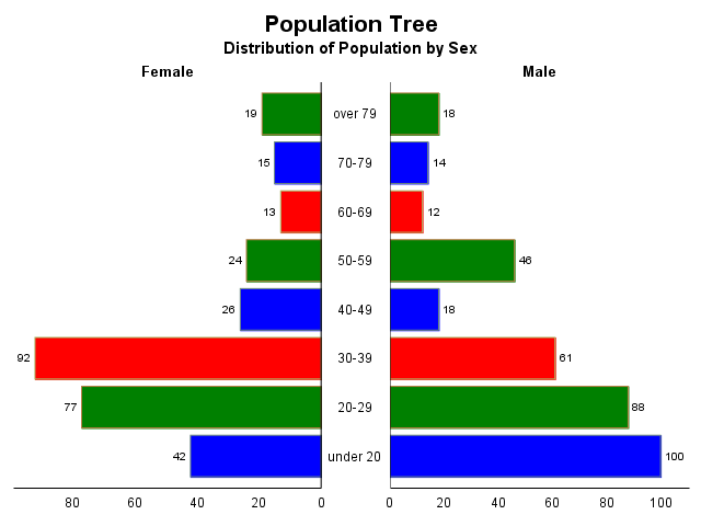
Fast forward to SAS® 9.4. ODS Graphics and SG procedures have been part of Base SAS® since SAS® 9.3, making it much easier to create high-quality graphs without using additional software. The graph that was previously created using the Annotate facility can now be created using the Graph Template Language (GTL) and the SGRENDER procedure. Here is the program to create the entire graph:
Note: The program below contains numbered annotations that correspond to a discussion below the program. So, if you copy and paste this program into SAS, be sure to delete the annotations before running this code.
data ratio; input Age $1-8 type $ Female Male; datalines; over 79 A 19 18 70-79 B 15 14 60-69 C 13 12 50-59 A 24 46 40-49 B 26 18 30-39 C 92 61 20-29 A 77 88 under 20 B 42 100 ; run; proc template; define statgraph population; ❶ begingraph /border=false❷ datacolors=(green blue red); ❸ entrytitle 'Population Tree' / textattrs=(size=15);❹ entrytitle 'Distribution of Population by Sex'; layout lattice ❺/ columns=2 ❻ columnweights=(.55 .45); ❼ layout overlay ❽/ walldisplay=none y2axisopts=(reverse=true tickvaluehalign=center display=(tickvalues)) xaxisopts=(displaysecondary=(label) display=(tickvalues line) reverse=true labelattrs=(weight=bold)); barchart category=age response=Female / group=type orient=horizontal yaxis=y2 barlabel=true; endlayout; layout overlay ❽/ walldisplay=none yaxisopts=(reverse=true display=none) xaxisopts=(displaysecondary=(label) display=(tickvalues line) labelattrs=(weight=bold)); barchart category=age response=Male / group=type orient=horizontal barlabel=true ; endlayout; endlayout; endgraph; end; proc sgrender data=ratio template=population; run; |
As you can see, this program is much simpler than the one created using Version 6 above. Let’s take a closer look at the code.
❶ The TEMPLATE procedure creates a GTL definition called POPULATION with the DEFINE statement.
❷ In the BEGINGRAPH statement, the BORDER=FALSE option turns off the outside border.
❸ The DATACOLORS option defines the colors for the groups.
❹ The ENTRYTITLE statements define the titles for the graph.
❺ A LAYOUT LATTICE block serves as a wrapper for the LAYOUT OVERLAY statements.
❻ The COLUMNS option in the LAYOUT LATTICE block defines the layout of the cells.
❼ Because the graph in the left cell contains the bar values, the COLUMNWEIGHTS option allocates more room for this graph. The values for COLUMNWEIGHTS need to add up to 1.
❽ Two LAYOUT OVERLAY statements define the two cells in this graph.
LAYOUT OVERLAY Code
The two LAYOUT OVERLAY blocks are similar, so we will look closer at only the first one:
layout overlay / walldisplay=none ❶
                 y2axisopts=(reverse=true
                 tickvaluehalign=center display=(tickvalues)) ❷
                 xaxisopts=(displaysecondary=(label) ❸
                 display=(tickvalues line) ❹ reverse=true ❺
                 labelattrs=(weight=bold));
   barchart category=age response=Female ❻/ group=type ❼
                           orient=horizontal ❽ yaxis=y2 ❾ barlabel=true; ❿
endlayout; |
❶ The WALLDISPLAY=NONE option turns off the border around the graph.
❷ The REVERSE=TRUE option reverses the Y axis order, TICKVALUEHALIGN=CENTER centers the tick mark values, and the DISPLAY=TICKVALUES option displays only the tick mark values. These options are specified within Y2AXISOPTS.
❸ DISPLAYSECONDARY=(LABEL) displays the X axis label on the X2axis, at the top of the graph.
❹ On the X axis, at the bottom of the graph, the DISPLAY=(TICKVALUES LINE) option displays the tick mark values and the axis line.
❺ The REVERSE=TRUE option also reverses the X axis.
❻ The bar chart contains a bar for each Age. The length of the bars is based on the values of the variable Female with the CATEGORY=AGE and RESPONSE=FEMALE options in the BARCHART statement respectively.
❼ The group variable, TYPE, determines the color of the bars.
❽ The ORIENT=HORIZONTAL option in the BARCHART statement specifies that the bars are horizontal.
❾ YAXIS=Y2 specifies that the values are plotted against the right Y axis, Y2 axis.
❿ The BARLABEL=TRUE option provides labels for the bars.
Here is the graph that is created when you submit this program:
As this example shows, SAS graphing capabilities have improved over the years just as transportation options have progressed. Be sure to take advantage of these improvements to create helpful visualizations of your data! If you would like to create a similar graph with PROC SGPLOT, refer to Sanjay Matange’s blog post “Butterfly plots.”
Version 6 program
/* set the graphics environment */ goptions reset=global gunit=pct border ftext=swissb htitle=6 htext=3 dev=png; %annomac; /* create the Annotate data set, POPTREE */ data poptree; /* length and type specification */ %dclanno; /* set length of text variable */ length text $ 16; /* window percentage for x and y */ %system(5, 5, 3); /* draw female axis lines */ %move(5, 10); %draw(40, 10, red, 1, .5); %draw(40, 95, red, 1, .5); /* draw male axis lines */ %move(56.1, 95); %draw(56.1, 10, red, 1, .5); %draw(95, 10, red, 1, .5); /* label categories */ %label(75.0, 97.0, 'Male', green, 0, 0, 4, swissb, 5); /* at top */ %label(25.0, 97.0, 'Female', green, 0, 0, 4, swissb, 5); %label(5.0, 5, '100', blue, 0, 0, 4, swissb, 5); %label(22.5, 5, ' 50', blue, 0, 0, 4, swissb, 5); %label(40.0, 5, ' 00', blue, 0, 0, 4, swissb, 5); %label(95.0, 5, '100', blue, 0, 0, 4, swissb, 5); %label(75.0, 5, ' 50', blue, 0, 0, 4, swissb, 5); %label(56.0, 5, ' 00', blue, 0, 0, 4, swissb, 5); /* label age */ %label(48.0, 15.25, 'under 20', blue, 0, 0, 4, swissb, 5); %label(48.0, 25.0, '20 - 29', blue, 0, 0, 4, swissb, 5); %label(48.0, 36.7, '30 - 39', blue, 0, 0, 4, swissb, 5); %label(48.0, 47.4, '40 - 49', blue, 0, 0, 4, swissb, 5); %label(48.0, 57.8, '50 - 59', blue, 0, 0, 4, swissb, 5); %label(48.0, 68.6, '60 - 69', blue, 0, 0, 4, swissb, 5); %label(48.0, 79.3, '70 - 79', blue, 0, 0, 4, swissb, 5); %label(48.0, 90.0, 'over 79', blue, 0, 0, 4, swissb, 5); /* male bars on right */ %bar(56.2, 10.5, 95.0, 20.0, blue, 0, solid); %bar(56.2, 20.71, 90.0, 30.71, green, 0, solid); %bar(56.2, 31.42, 80.0, 41.52, red, 0, solid); %bar(56.2, 42.14, 62.0, 52.14, blue, 0, solid); %bar(56.2, 52.85, 72.0, 62.85, green, 0, solid); %bar(56.2, 63.57, 60.0, 73.57, red, 0, solid); %bar(56.2, 74.28, 61.0, 84.28, blue, 0, solid); %bar(56.2, 85.0, 63.0, 95.0, green, 0, solid); /* label male bars on right */ %label(95.0, 20.0, '100', black, 0, 0, 4, swissb, 7); %label(90.0, 30.71, '88', black, 0, 0, 4, swissb, 7); %label(80.0, 41.52, '61', black, 0, 0, 4, swissb, 7); %label(62.0, 52.14, '18', black, 0, 0, 4, swissb, 7); %label(72.0, 62.85, '46', black, 0, 0, 4, swissb, 7); %label(60.0, 73.57, '12', black, 0, 0, 4, swissb, 7); %label(61.0, 84.28, '14', black, 0, 0, 4, swissb, 7); %label(62.0, 95.0, '18', black, 0, 0, 4, swissb, 7); /* female bars on left */ %bar(39.8, 10.5, 25.0, 20.0, blue, 0, solid); %bar(39.8, 20.71, 15.0, 30.7, green, 0, solid); %bar(39.8, 31.42, 10.0, 41.42, red, 0, solid); %bar(39.8, 42.14, 32.0, 52.14, blue, 0, solid); %bar(39.8, 52.85, 33.0, 62.85, green, 0, solid); %bar(39.8, 63.57, 36.0, 73.57, red, 0, solid); %bar(39.8, 74.28, 35.0, 84.28, blue, 0, solid); %bar(39.8, 85.0, 33.0, 95.0, green, 0, solid); /* label female bars on left */ %label(25.0, 20.0, '42', black, 0, 0, 4, swissb, 9); %label(15.0, 30.7, '77', black, 0, 0, 4, swissb, 9); %label(10.0, 41.42, '92', black, 0, 0, 4, swissb, 9); %label(32.0, 52.14, '26', black, 0, 0, 4, swissb, 9); %label(33.0, 62.85, '24', black, 0, 0, 4, swissb, 9); %label(36.0, 73.57, '13', black, 0, 0, 4, swissb, 9); %label(35.0, 84.28, '15', black, 0, 0, 4, swissb, 9); %label(33.0, 95.0, '19', black, 0, 0, 4, swissb, 9); run; /* define the titles */ title1 'Population Tree'; title2 h=4 'Distribution of Population by Sex'; /* generate annotated slide */ proc gslide annotate=poptree; run; quit; |
2 Comments
You can also create a butterfly chart with the ODS Graphics Designer. From SAS select Tools-> ODS Graphics Designer. When the ODS Graphics Window displays you should see the Graph Gallery. Click on the Custom tab. From here you can click on Butterfly or Butterfly2 to create the graph interactively.
It's always fun to take a walk down memory lane.
I notice that you are using the SG graphics, which are now part of Base SAS (not SAS/GRAPH). Starting with SAS 9.2, you can create a butterfly chart by using only PROC SGPLOT: no GTL required. You do have to manipulate the data a little. See http://blogs.sas.com/content/iml/2010/09/28/comparing-cell-phone-use-by-age.html