An issue that SAS/GRAPH users have wrestled with in the past has been how to put tick marks at irregular intervals on their axes. In PROC GPLOT, if you specify irregular intervals using the ORDER option on the AXIS statement, the procedure’s axis kicks into a “discrete” mode, where the tick values are placed at equal distances despite the tick values. I have seen SUGI posters describe workarounds for this situation. Most techniques involve turning off the axis tick values, moving the axis origins to create space, and using annotate to draw the tick values in their correct numerical location.
With the ODS Graphics system, correct placement of tick marks based on value is an automatic behavior, even with irregular intervals. The following examples using PROC SGPLOT show you how you can control tick value placement with a combination of simple options.
First, it is important to understand that the data range of an axis is independent from the tick mark placement. In the example below, notice that the two plot points extending beyond the end tick marks. The true X-axis data range goes from 50.5 to 150, but “nice” tick values are automatically chosen within that range to display on the axis.
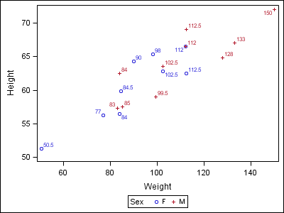
proc sgplot data=sashelp.class; scatter x=weight y=height / group=sex datalabel=weight; run; |
Because the axis range and the axis ticks are independent, you can specify a list of tick values and have them placed correctly along the axis range.
There are four axis options in PROC SGPLOT and PROC SGPANEL that control axis range and tick placement: MIN, MAX, VALUES, and VALUESHINT. The MIN and MAX options set the minimum and maximum for the axis range while leaving the tick mark choice up to the system.
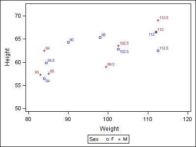
proc sgplot data=sashelp.class; xaxis min=80 max=120; scatter x=weight y=height / group=sex datalabel=weight; run; |
The VALUES option give you the ability to both set the range min/max, as well as the tick values that are displayed. The tick values can be specified as a combination of individual values and “M to N by INCREMENT” specifications.
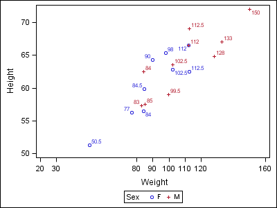
proc sgplot data=sashelp.class; xaxis values=(20 30 80 to 120 by 10 160); scatter x=weight y=height / group=sex datalabel=weight; run; |
The VALUESHINT option changes the behavior of the VALUES option. When VALUESHINT is specified in conjunction with the VALUES option, the minimum and maximum values in the list no longer set the range for axis, and any of the specified tick values that fall within the axis range are drawn – the rest are ignored. This means that you can specify a large list of custom tick values while not impacting the true data range of the plot. If the data changes in subsequent runs, different parts of your tick list will be displayed.
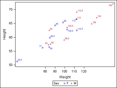
proc sgplot data=sashelp.class; xaxis values=(20 30 80 to 120 by 10 160) valueshint; scatter x=weight y=height / group=sex datalabel=weight; run; |
Finally, It is important to note that the VALUES and VALUEHINT options affect only LINEAR axes, while the MIN/MAX options may be used on all axis types except DISCRETE. If you need to use the VALUES/VALUESHINT options in a logarithmic case, you can compute a separate column of log values and plot them on a LINEAR axis using these options.


6 Comments
Very cool!
Pingback: Axis values and hint - Graphically Speaking
I love this feature! One question I have, though, is on the XAXIS statement is it possible to change the size and type of the font used for the label ("Weight" in this example)? If not, must it be done with PROC TEMPLATE? Could you point to an example of this? Thanks!
With SAS 9.3, yes, you can use VALUEATTRS or LABELATTRS on the axis statement to set the font attributes. With SAS 9.2, you have to to do this by changing the ODS style. Here is a simple example of editing the graph font attributes in the style using proc TEMPLATE:
proc template;
define Style styles.mystyle;
parent = styles.listing;
style GraphFonts from GraphFonts /
'GraphDataFont' = (", ",5pt)
'GraphValueFont' = (", ",7pt)
'GraphLabelFont' = (", ",9pt);
end;
run;
hello,
How to label the values in an overlay graph where condition is -
PROC GPLOT DATA = ;
PLOT var1 * var var2 * var var3 * var/
OVERLAY
VAXIS=AXIS1
HAXIS=AXIS2
FRAME LVREF=1
CVREF=RED
VREF=7
LEGEND=LEGEND1
;
please help...............................
When using GPLOT, you can use the POINTLABEL option on the SYMBOL statement to label your data points.