Getting the axis values just right generally requires some work, and the values you want can change from case to case. One such example was discussed by Dan Heath in his post on custom axis values. Here Dan shows the usage of non uniform axis values using the VALUES option on the axis statements.
Another usage is when you want specific values on the axis, but only within the actual range in the data set. Say I want to make monthly graphs of average daily temperature in Albany, NY as referenced in the article on polar graphs. The graph has the average daily temperatures for only one month. I want the Y axis to always use round values with an increments of 5 degrees, but only span the data for that month.
By default, I will get different increments based in the range of the data for each month. You could specify the values, but then these values will determine the range of the data on the axis. There is no way to just specify "by=5" in the values option.
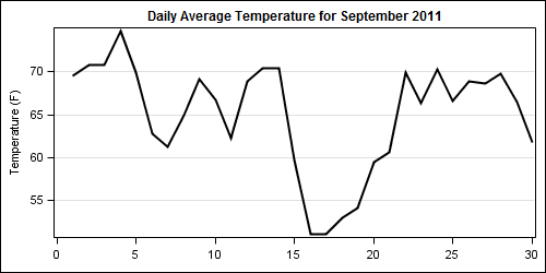
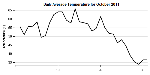
To get specific axis values you want, but only within the current data range, you can use the VALUESHINT option. The graphs below show the average daily temperatures for the months of September and October 2011. Note the Y axis values on each graph.
September 2011:
October 2011:
Code:
title 'Daily Average Temperature for October 2011'; proc sgplot data=temp2011; where month=10; series x=day y=temp / lineattrs=(thickness=2); yaxis grid values=(-20 to 100 by 5) valueshint; xaxis display=(nolabel); run; |
In both programs, we use the identical setting for the YAXIS values which cover the whole expected range of temperature data along with the VALUESHINT option. This allows each axis to have nice round tick values with an increment of 5, but only those that fall in the data range. If we did not provide the VALUESHINT option, both axes would be forced to a range of -20 to 100. This feature can be very useful when using the BY statement.
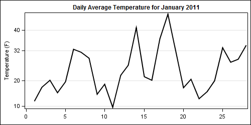
VALUESHINT also works with a list of values. In this case, we always want the axis to be in increments of 10, but with the value of 32 included if appropriate as shown below.
Code:
title 'Daily Average Temperature for January 2011'; proc sgplot data=temp2011; where month=2; series x=day y=temp / lineattrs=(thickness=2); yaxis grid values=(-20 -10 0 10 20 32 40 50 60 70 80 90 100) valueshint; xaxis display=(nolabel); run; |
Now, we get a Y axis with the values as listed, but only those that fall within the range of the data.
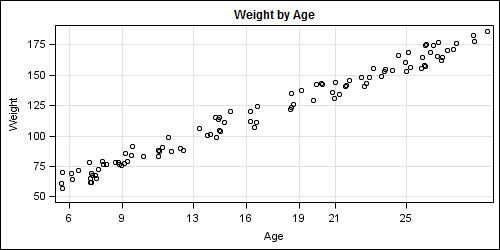
Here is another example, where we are plotting (simulated) data for weight by age. On the age axis, we want the specified age values and gridlines, but only within the actual range in the data.
Code:
title 'Weight by Age'; proc sgplot data=age; scatter x=age y=weight; xaxis grid values=(6 9 13 16 19 21 25 30 40 50) valueshint; yaxis grid; run; |
Use the axis VALUES and VALUESHINT options to customize the axis to your needs.
Full SAS 9.2 Code: TickValueHint


2 Comments
Your examples are all where the actual data is smaller than the range given for the respective axis. What is just as useful is when the data range exceeds the axis range given. For example, the data may just exceed 0 - 100 when jittered, but -5 to 105 by 5 need not be used to replace 0 to 100 by 10 if valueshint is used.
uneven values working for SGPLOT but Not for SGPANEL (colaxis/rowaxis)