Get the right information, with visual impact, to the people who need it
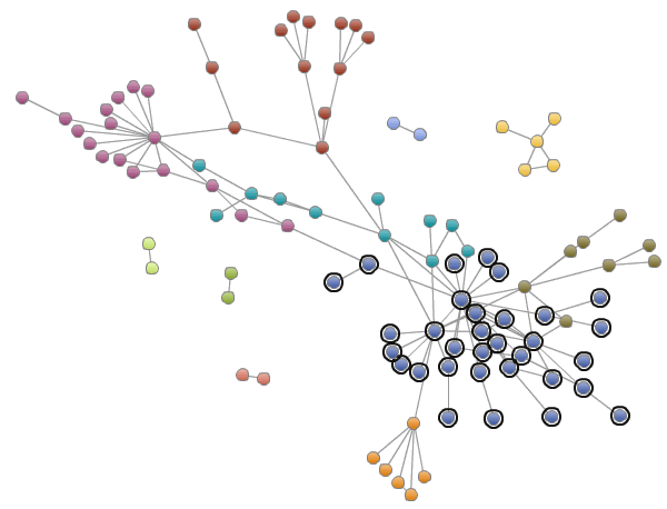
Exploring social networks with SAS Visual Analytics

In this interconnected world, it is more important than ever to understand not just details about your data, but also how its different parts are related to each other. Social networks reveal often surprising details about what people think about your product or services, how they are linked to other