Get the right information, with visual impact, to the people who need it
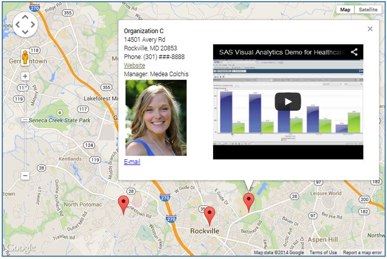
The power of SAS-generated InfoWindows in Google maps

➤ DISCLOSURE! In June 2018 Google introduced changes to the way it handles its Maps platform. They now require API key in order to embed a map, plus Google Maps "projects" must now be associated with a billing account. Unless these new Google rules are met, Google maps described in