Get the right information, with visual impact, to the people who need it
Clinical Graphs

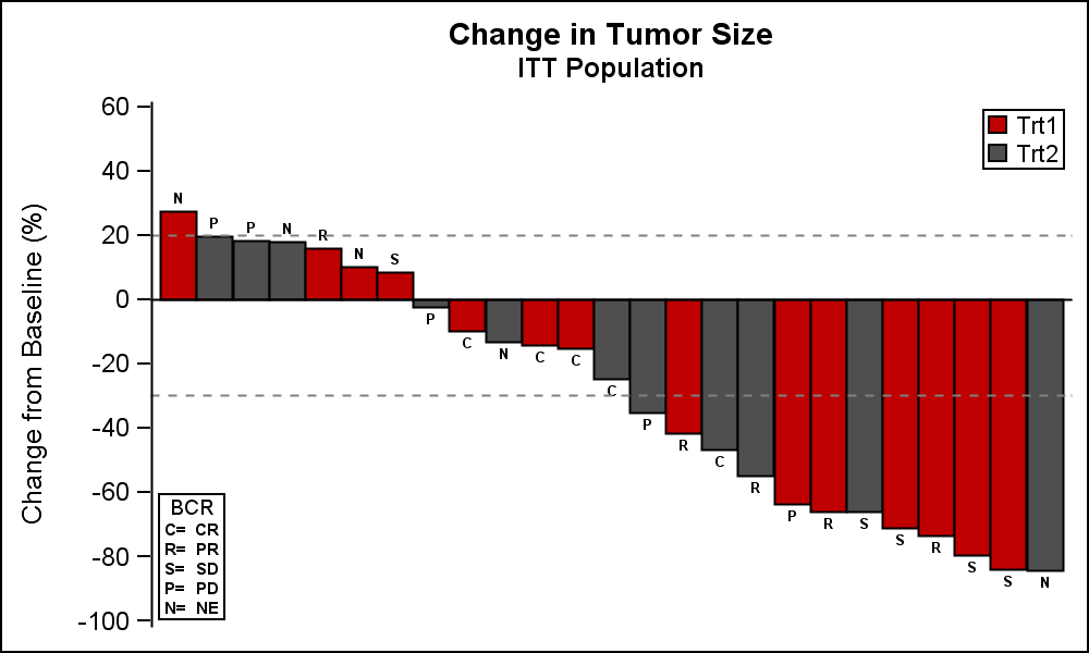
This week I had the opportunity to present a 1/2 day seminar on creating clinical graphs using the SG procedures during an In-House SAS Users' group meeting. I have presented this seminar quite a few times now, and I always learn something. The audience was very receptive, with some people