Get the right information, with visual impact, to the people who need it
Pokémon: Gotta graph 'em all!

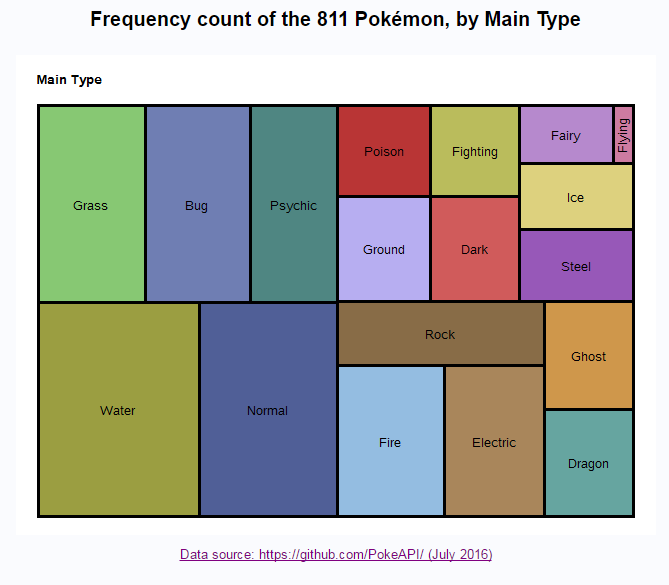
So, how many different Pokémon have you caught - and more importantly, how many different kinds are still out there that you haven't caught yet? I've created some graphs that might help you figure it out! I think my previous blog post might have irritated some of the hardcore Pokémon players out there