Data Visualization

Get the right information, with visual impact, to the people who need it

Data Visualization
Sanjay Matange 0
Axis values display

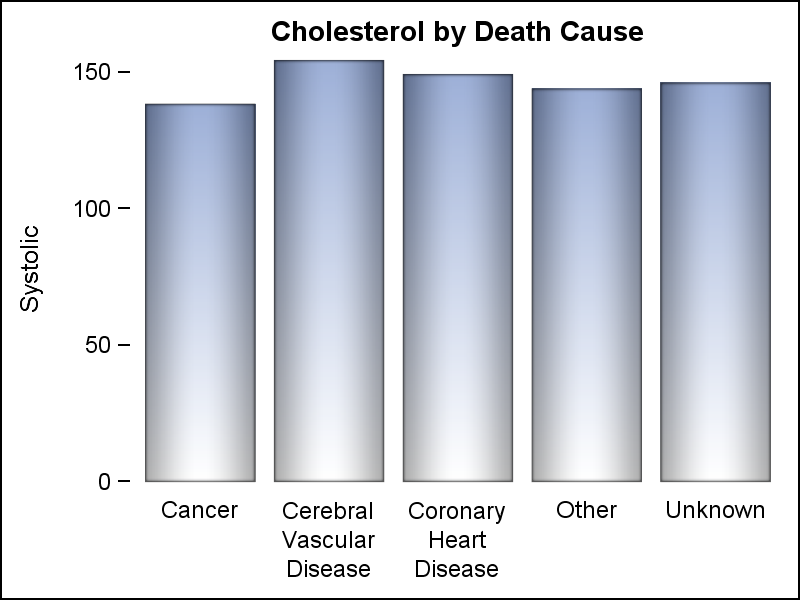
Displaying nicely rendered axis values reduces clutter and makes the graph more readable.  With SAS 9.4, we added the ability for splitting x-axis tick values on white space to create a nice and readable x-axis as shown in the graph on the right. It is always a challenge to fit

Data Visualization
Sanjay Matange 0
ODS Graphics Designer

Some observant readers may have noticed a new icon on the right sidebar of this blog announcing the release of the new SAS Press book on the ODS Graphics Designer, written in collaboration with Jeanette Bottitta.  Jeanette is a Technical Writer at SAS and has worked on various SAS Graphics products

Analytics | Data Management | Data Visualization
Ian Jones 0
No data scientist? No analytics platform? No problem.

“Analytics” and “data scientist” aren’t new terms, but they are trending buzzwords. The popularity of these concepts has created a false impression: Analytics are mysterious abstractions that can only be decoded if you have a white lab coat and an advanced degree in computer science. The reality couldn’t be more different.

1 313 314 315 316 317 537