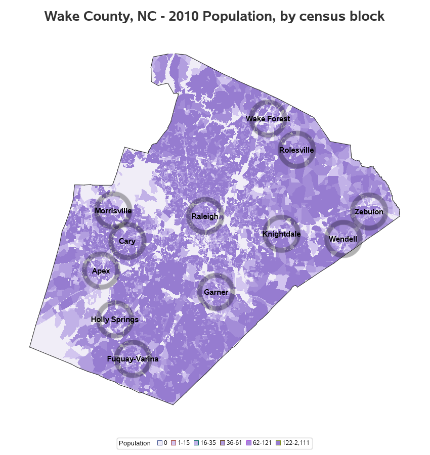
Get the right information, with visual impact, to the people who need it
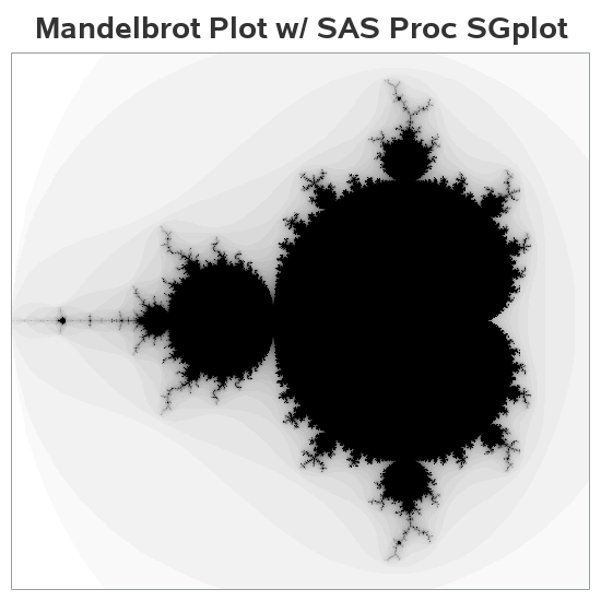
Fun with Mandelbrot sets and Proc SGplot

A few years ago Mandelbrot sets and fractals were all the rage! (Am I showing my age? Hahaha!) I thought creating some plots of this type of data would be a good way to sharpen my SAS programming skills, and it would make a nice/interesting example to help teach people