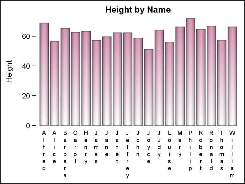
Yesterday, I published an article on Axis values display, where I mentioned the desire expressed by many users to get x-axis tick values in Hotel text orienttion. The name comes from the way many hotel signs are displayed as shown on the right. Such arrangement of text can also be very
Tag: TickValueFitPolicy
Often we have situations where the category values on the graph have long character strings. This is often the case when graphing survey responses to questions. The questions may be sentences, sometimes moderately long. With SAS 9.4, GTL and SG now support the ability to display tick values split over
Last week Bruno asked about creating a Schedule Chart using SG Procedures. To me, such projects are very interesting and challenging...How much mileage can we get out of the current set of SGPLOT procedure features to create a visual that was not part of the original requirements? The clear choice for
This post is a result of an intriguing question posed by a user on the SAS communities' page. How to create a bar chart where the category is a combination of two variables var_1 and var_2 (each with values of '+' and '-'), and get a X axis that shows each