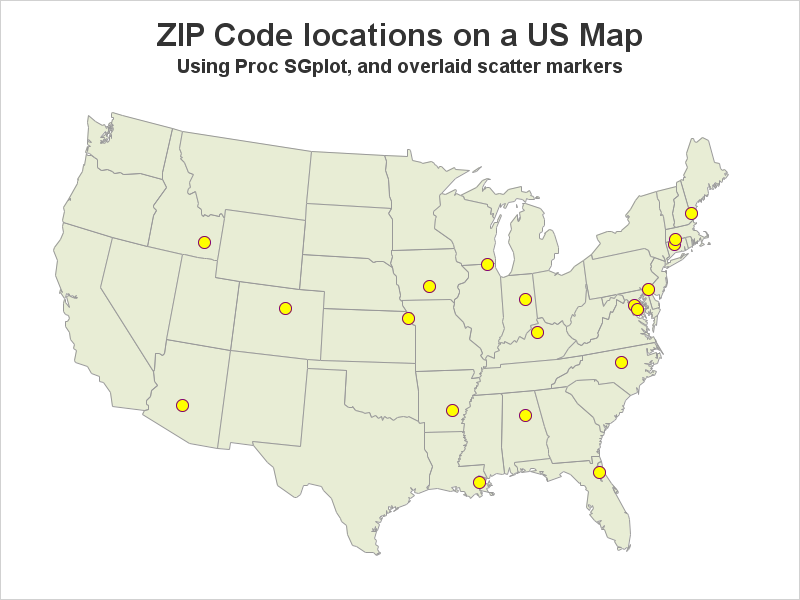
For those of you who don't have SAS/Graph's Proc GMap, I recently showed how to 'fake' a variety of maps using Proc SGplot polygons. So far I've written blogs on creating: pretty maps, gradient shaded choropleth maps, and maps with markers at zip codes. And now (by special request from
Tag: sgplot_maps
Users frequently ask how to plot their data as markers on a map. There are several ways to do this using SAS software. If you're a Visual Analytics user, you can do it using a point-and-click interface. But if you're a coder, you might need a little help... In this
If you're a fan of SAS' ODS Graphics, you probably know that it does pretty much everything except geographical maps. But it's flexible enough that you can "fake it 'till you make it"! This example describes how to fake a geographical (choropleth) heat map using Proc SGplot polygons. In my
If you give an artist some tools, they can create a pretty picture. Sure, they might have a preferred tool - but they can probably do a pretty decent job no matter what you give them (paint, colored pencils, watercolor, charcoal, etc). And creating pretty graphs in SAS is no