Creating Spaghetti Plots Just Got Easy

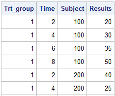
This article is by guest contributor Lelia McConnell, SAS Tech Support. Creating Spaghetti Plots Just Got Easy Sample 38076: “Response by patient and treatment group” illustrates how to generate a spaghetti plot using the SGPLOT procedure. Sample 40255: “Plot of study results by treatment group” illustrates how to generate a