Tag: Scatter

Data Visualization
Sanjay Matange 0
Sankey Diagrams

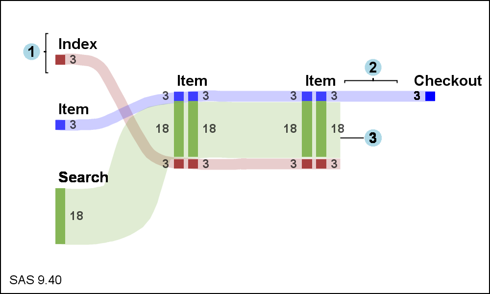
Sankey Diagrams have found increasing favor for visualization of data.  This visualization tool has been around for a long time, traditionally used to visualize the flow of energy, or materials.   . Now to be sure, GTL does have a statement design for a Sankey Diagram which was implemented only in Flex for use

Data Visualization
Sanjay Matange 0
Margin Plots

Last week a user wanted to view the distribution of data using a Box Plot.  The issue was the presence of a lot of "bad" data.  I got to thinking of ways such data can be visualized.  I also discussed the matter with our resident expert Rick Wicklin who pointed

Data Visualization
Sanjay Matange 0
Binary Response Graph

Often we need to plot the response values for binary cases of a classifier.  The graph below is created to simulate one seen at http://www.people.vcu.edu/ web site of the shock index for subjects with or without a pulmonary embolism.  In this case, the data is simulated for illustration purposes only. There

1 2 3 4 5 8