Back in February, I posted an article on creating Adverse Event Timeline Graph. In the SAS 9.2 version (first one), one item that was less than ideal was the way to position the AE names to the left of the event. The AE names are displayed using the scatter plot statement
Tag: non-proportional Font

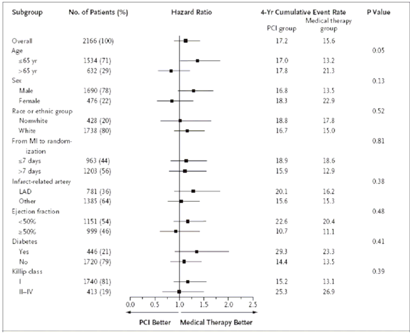
During SAS Global Forum 2012, I had conversations with many SAS users who wanted to create Forest Plots. However, there was one new twist. The study names were subgrouped by categories like 'Age', 'Sex', etc., with multiple entries under each subgroup. The name of each study within the subgrouped was indented