Tag: GTL

Rick Wicklin 0
Create a contour plot in SAS

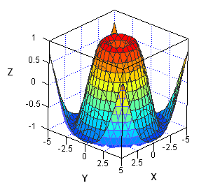
When I need to graph a function of two variables, I often choose to use a contour plot. A surface plot is probably easier for many people to understand, but it has several disadvantages when compared to a contour plot. For example, the following statements in SAS/IML Studio displays a

Data Visualization
Sanjay Matange 0
Broken Y-Axis with SAS 9.2

In the previous post on Broken Y-Axis, I reviewed different ways to display data as a Bar Chart, where the response values for some categories are many orders of magnitude larger than the other values.  These tall bars force  the display of other values to be squeezed down thus making it harder to compare

1 29 30 31 32 33 37