Often we have situations where the category values on the graph have long character strings. This is often the case when graphing survey responses to questions. The questions may be sentences, sometimes moderately long. With SAS 9.4, GTL and SG now support the ability to display tick values split over
Tag: GTL
Survey Charts

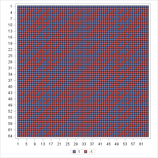
Visualize a matrix in SAS by using a discrete heat map
A heat map is a graphical representation of a matrix that uses colors to represent values in the matrix cells. Heat maps often reveal the structure of a matrix. There are three common applications of visualizing matrices with heat maps: Visualizing a correlation or covariance matrix reveals relationships between variables.
Graphs at WUSS - Part 1
It is always a pleasure to attend SAS user conferences, regional conferences and in-house events. In addition to presenting papers, seminars and super demos to the attendees myself, my favorite activity is to attend presentations by users that include graphical data visualization. These include using SG procedures, GTL, Designer or SAS/GRAPH. This year

