Tag: GTL

Data Visualization
Sanjay Matange 0
Graph Table

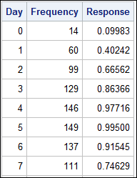
A common scenario is where we have a table of multiple measures over time. Here we have a simple example of Frequency and Response by Day.  The Response is a linear function of the Frequency, as shown in the table on the left below. The  shape of the data is

Data Visualization
Sanjay Matange 0
Axis Thresholds

Have you ever wondered why sometimes a SGPLOT or GTL graph has markers drawn beyond the extreme tick and value on an axis and sometimes not?  And, if you prefer your graphs to always have tick values on the axis that cover the whole range of data, how can you

1 10 11 12 13 14 37