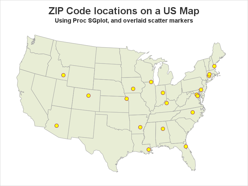
예술가들은 몇 가지 도구만으로도 멋진 그림을 그릴 수 있습니다. 물론, 물감, 색연필, 목탄 등 선호하는 도구는 저마다 다를 수 있겠지만 말이죠. SAS에서 멋진 그래프를 만드는 방법도 크게 다르지 않은데요, 오늘은 그 방법을 예를 들어 설명해보고자 합니다. SAS에서는 SAS/Graph Proc GMap을 사용하여 멋진 지도를 만들 수가 있습니다. GMap은 SAS가 지도 제작용으로 특별 개발한
For those of you who don't have SAS/Graph's Proc GMap, I recently showed how to 'fake' a variety of maps using Proc SGplot polygons. So far I've written blogs on creating: pretty maps, gradient shaded choropleth maps, and maps with markers at zip codes. And now (by special request from
Users frequently ask how to plot their data as markers on a map. There are several ways to do this using SAS software. If you're a Visual Analytics user, you can do it using a point-and-click interface. But if you're a coder, you might need a little help... In this